16.5.14

Hunger Games - Character development

After I came out of the cinema from watching the second entry film adaptation of the Hunger Games saga, Catching Fire, I couldn't help to feel an extreme joy to see such a good adaptation to such a marvelous trilogy of books. I was clearly speaking as a fan as I rushed to talk about it with my partner. It turn out he wasn't very impressed; after he saw not long before the first entry on DVD he thought the sci-fi side of it with hovercrafts, high speed trains and the ridiculous outfits of the Capitol were just unnecessary for the story. Fare point if science fictions is not his thing but he did say "...but somehow the characters seem rather different from the first one."
Drawing a smile on my face I went mental and bombarded him with detail that were cut out of the films to fit the time scale, but certainly added something extra to the development of the characters. 
The main characters notoriously react to all the events that happen in the first entry and acted in their own particular ways which gave way to the creation of their personalities. I realised that this is something that happens in most stories in which the main character faces a problem or obstacle to achieve some desired. In this case it was surviving itself, which in fair true is nothing new and is frecuently compared to the book Battle Royale by Koushun Takami in 1999 by having a similar concept. I've only seen the film but not read the book therefore I don't feel in position to say whether or not is true.
All I can see in this film adaptation is a fantastic cast embodying the characters to their best. 
My personal favourite is Effie as she's a character that was raised outside the environment of most of the main characters, yet she develops attachment and a realisation that her side is doing wrong. In the first entry of the film she reflects only her interests and she seems excited about the celebration of the Hunger Games, yet in the second one she has to fake a mask to put up in
front of the cameras, but her true feelings have already changed.


The main character Katniss has a different develpment, as from the beggining she's already strong and independant. After she enters to the Hunger Games her perseption changes due to the cruelty she's exposed. By the second entry she's numb and confused, yet her determination of protecting her love ones is greater than herself. 


Other characters are interesting as well, including the drunk Haymitch, and ex champion of the hunger games, who starts cold and gives a crap about what happens to anyone, yet later on he develops a close relationship (even thought he hides it) and tries to help. 


Realistic games - same reality, different different story

Among the many things that came into my mind when designing my game level for Extended Practice (FMP) was not only the aesthetics, but also other factors like engines, audience, music, and game play.
This last one is frequently taken for granted, but it is this game play factor that brings those games every now and then that break boundaries and stand out for their originality. When the Wii first came out, it was highly criticised because of the control, but later on (same with the Nintendo DS) it became accepted and innovative for many games.
But it's not only the console that matters, but the idea behind the way you play the game story that can make a game unique. I ended up going to the good old platformer, mainly because I don't have the skills to code an innovative game, but certainly I would have liked something more creative.
When I was planning what to do for my game, I remembered games like Run, Zombie, run! for iOS which is basically an audio game that uses GPS (like treasure hunt) and encourages people to run in diferent locations and exercise while playing a game. The narration will guide you along to points where you can pick up items and the amount of miles/kilometres that you run in real life will become points that will allow you to later on upgrade and keep some people in refugees alive. The level of physical collaboration in this case brakes the boundaries, like the WiiFit concept. This interaction with the reality makes the player to see the world in a different way, and just like the 3DS tried with the AR (Augmented Reality) to merge the gaming world with the fictional one.

Not always consoles or game graphics are required, just like Role playing games or even games that everyone play when kids, there are other ways to create fun out of anything. This is where the gameplay comes in place; creating a few rules to follow and having fun with it.
Something I came across on Tumblr a while ago was the ' Find the airport' game:
Let's Play a game
To play this game, go to MapCrunch, select 'hide location, make sure you have all countries unselected, and click go. What this will do is drop you in a random part of the world. It's as if you woke up on the side of a road in an unfamiliar country. The goal of the game is to find you way to an airport so you can return home.
Bonus Hard mode: No using outside sources, and that includes using google maps to figure out your location from signs or landmarks. 


I found this idea quite fun, and to a certain point realistic (only because it's playing on real world maps. I love the idea of street passing, GPS location and immersion of games into the real world. Hope to see more games developing ideas that will give the real world a bit of a different twist. Isn't that why we play games for? 

15.5.14

Submission product - Beta version


Like I mentioned on my previous post, the game is technically finished, the only things I'll be fixing after is probably touching up some sprites and animations, dialogue timing, music enhancement and camera angles. For the submission, I believe I've reached the requirements, which were a playable level with pixel art.
At this point I'm quite pleased with the quality and with the proficiency on which I feel I can use the engine now. Never the less, I am aware that there's a LOT of room for improvement, and certainly will carry on polishing it for the final year show and the Game Republics student showcase in Huddersfield.
If you want to have a go at it, here's the link to the online file:


[if there's any obvious problems please refresh the browser. If it doesn't fix the problem, let me know. Also it was designed and mainly tested on Google Chrome, but as far as I'm aware, it should work on Firefox and Safari] (give my level some dignity and don't use Internet Explorer...please...) 

Because I realised that not many people might wan't to have a go at it or probably they get lost ... or just want to cross your arms, lay back, watch and judge my work then here's a screen recording of me playing the game (me knowing what to do). There are conversations with the characters outside the main main storyline, just in case people get lost, and also to give a bit of inside to the story and the characters.

Any feedback would be more than appreciated it, as I still have the end of year show and the Game Republic Student Showcase.


14.5.14

Final crit feedback

Last week we had our final crit before the submission deadline. The idea consisted on leaving your work on a computer and let people look/have a go and then write some feedback on a piece of paper.
I was quite impress with most people's work, I'm quite happy to see how much everyone has improved.

The feedback that I got back from the Test 3 of the game level was generally positive. People seem to like the artwork, which was my main objective.
Because at this point I had quite a few props to make and the dialogue was still not in place (at least not all) therefore I changed some of it, so that the characters would explain that it was a demo and that parts of the level weren't functional.
People managed to spot some text boxes out of place and that the font was hard to read. At that point the scripting of the dialogues was in process so I knew I had to reposition everything. I worked on a more readable font and because of the 'language' Construct 2 uses, I couldn't use "...". The original script I made used that quite a lot, so instead I worked on a sprite based font, that would allow me to make a "..." merged into one single character, saving me space and typing. The problem with sprite font is that is hard to control the kerning as they all have a set pixel size, but I think it's a lot more readable than the default option.


There are so many other changes that needed taking place, but there was not much point at this stage to just place the assets half way done and not having the story to drive. 
Either way, I was pleased to see that it was playable and for the first time see people having a go at it. 
Next post will be the beta version, where all the text will be in place and in theory be playable all the way through, yet I'm expecting to carry on with adjustments for the end of year show. 


10.5.14

Idle sprites - from concept to pixel art

Although I know that having made fully rendered graphics for the entire game (ie choosing a resolution and drawing it all) would have been slightly more within my comfort zone, I was determined to for once, make an entire project on pixel art. After comming along with some of the main characters' concept art  that mainly where made as promotional art I started making the conversion into in-game graphics.
I knew I was going to make big sprites and stay away from 8 or 16 bit graphics as I wanted to portraid a nice amount of detail. 
The first character I wanted was obviously the main character Kamea, which pretty much has been used as a reference for the rest of the level. Because she's meant to be quite short, all the other characters would normally feel quite tall, therefore I had to think of a way for the sprites to look approachable (with some exceptions). 
From the concept art, Kamea kept quite a lot of features. Same happen with the nymphs Alba And Kera, but in the case of Teles and Azmer it was a total remake from the original concept image, mainly to fit the scene.


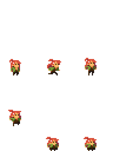
I've already talked about the animation for Kamea. She was clearly the most challenging one due to having motion. The rest of the characters only have an idle animation. I was literally make a breathing 2 frame animation, but challenged myself to a bit of extra motion, and managed to get something a bit more exciting in 6 frames for each character:

Alba and Kera

Azmer


 Edric


 Teles


Must admit that pixel art animation is not easy, but I enjoyed animating Teles and the nymphs the most. 
I want to try more flames and liquids next time! :)

Sprite Animation

I've done some work before related to animation in games, yet it always amazes me how hard it is to get it to look right, specially when there are several quick actions the player must make. In this case I'm lucky that the level doesn't feature any complicated mechanics as this keeps the animations to the minimal, giving me more time to work on them and get some fluid movement.
At this point in time I'm already behind, therefore I don't have the luxury of animating every single aspect of the game, yet Kamea is obviously the character that will have most of my attention.
Ryan agreed from the beginning to help me out by comming out with some rough animations which I could the draw over and fit the sprite. This is the walking cycle he came up with:


Knowing tthe amount of work he's got with his own project, I didn't feel like asking him for any corrections or any othe cycles, therefore I opted to adventure myself on the animation process.
No matter how much I looked for video reference I couldn't find something that I felt right so I had to make my own reference (which will never see the daylight ever). 
The idle idea didn't require reference at all as it was just a simple breathing movement, eye blinking, ear moving and perhaps a bit of exaggeration on the movement of the hair, mainly to accentuate the idle animation.


The runnin was a challenge as it was a 10 frame animation with all different frames. The character is not fully on side view as I keep this cartoony feeling of 'always looking at the camera' and that made the refencing a bit difficult. I managed with the front arm to give a bit of depth feeling, but I failed to do the same with the hair. I was quite pleased with the outcome for this running cycle as I tend to always get it weird looking, specially when it's a run that loops endlessly.


For the jump and fall I thought about making a proper animation that included a bit of anticipation, but no matter how I wanted it to fit it in, it will always look weird as the fluidity of the character in play doesn't include that small pause needed. At the end I decided to stick with only two frames for the jump (because of the determined hight that she can jump) and 3 for the fall (in case the player falls from a higher place).
Hopefully I'll have enough time to fit in a climbing animation, other wise I'll have to re adapt the level with some platforms instead of climbing ropes. 
As for the rest of the NPCs I'll only stick with a very very VERY basic idle, just to make them stick out as interactive characters, but if I have more time to before the Game Republics student showreel then I'll probably add some extra frames.

Meet: Alba & Kera

Alba and Kera are the two nymphs that lie in the far end of the conservatory. Alba (orange skin) is possess the power of dawn while Kera the power of dusk. Never meet each other while being free, yet once they where captured and locked up in a cell, secluded from the rest, they found out that they where in perfect sync, both body movements and thoughts. Their individual powers are unknown, but definitely strong. They've never convinced forces before, yet they can sense that it can be a powerful weapon. They rely on their voices to cast their powers with words, yet the collars implanted by 'him' prevent them from making any incantation. The cage itself also helps to keep their powers under control. The flame over their heads represents their power and emotions, yet it can't actually make anything caught fire. Ever since they've been there, they have become the main adoration of 'him' and he's been the only one that has come in contact with them. The backstory of the nymphs is unknown. 


Alba and Kera where the must fun and sexy to come up with. There where so many ideas that came to my mind, from plant like humanoids to bird-like creatures. I wanted to avoid an elf look and also a ying yang concept. They're still representing opposite entities, but at least I managed to balance it out with some colour and features like the horns. Most of the features where inspired in biblical images with the halo and the flames, yet I added some horns to Alba (but doesn't mean she's evil). Being nymphs, I couldn't come up with clothing for them, as they represent free natural spirits, so I added a massive amount of hair (although they might still be quite...  provocative). I wanted to keep them secluded from the rest of the characters; by not having much interaction with the players in the level I made them into a special characters (you can only access them near the end). Enjoyed playing with loads of colours, specially on their eyes. Hope their (almost) nudity won't create any kind of trouble...

Meet: Edric

Edric is a british dragon with an incredible amount of power. The only way to seal his power was with the power of a magic sword that pierces his mouth. His not the smartest creature out there, and he's not good with words, but normally he's a docile and noble creature. He's the first one to come in contact with Kamea, and luckily for him, she doesn't miss judge him based on his looks. He manages to encourage Kamea to explore around while hoping to free himself and get revenge on the one that got him captive. 


His initial design was always a big creature in relation with the rest of the characters, I probably never got to a point where I came up with the entire design of the body as I knew for this level only a small part was going to be shown. The idea of him being nice and docile was always appealing, trying to break the idea of judging character by how they look. Normally he would be put as a cold beast fighting against the 'good guys'. I tried to go for different colours like blue, green and black, but ended up going back to a more 'classic' red colour and with scales. Made the blood blue to make a high contrast and make it look like he's constantly bleeding as he tries constantly to escape. He's one of my favourite characters, as I can imagine him being like a big body guard for Kamea. Happy with the end design, shame I didn't have the time to draw the rest of his body. 


Meet: Azmer

Azmer is a snow Wemic (half lion, half human). He possess a good balance between strength, wisdom and ability. He was leader of the group that protected the pride. Being a rare type of Wemics, they started being hunted by witches trying to get hold of their rare fur. While trying to defend the pride from an attack, he sacrificed himself in order for the rest of them to scape. His loyalty to the pride is what has kept him locked up in a tiny cell ever since as he refuses to give away their location and fights back at any chance he gets. 


Azmer was definitely the most difficult character to come up with. I knew from the beginning that I wanted to make him as 'manly' as possible, but it's something I'm not entirely used to draw. The initial idea was to make a centaur, then a half human, half bull, but I was never entirely pleased with it. To this point I think there are a lot of thing I could have change to the final design. Muscles and middle aged people is something I need to practice a lot more. I also had to use some reference for the lion part of the body. Should also have played more with the colour scheme, but I wanted to make something completely opposite to what Teles is. No doubt that this is the character that I feel less proud of the outcome. :(   (practice practice practice) 


30.4.14

Branding - logo for everything

Something that I always tend to do is branding my ideas; give them logo, themes and anything that can help making it feel like a unified project. 
In the case of Sanctuary I tried to embraced the art nouveau/ Victorian style as much as possible, by keeping detail and lively colours. Of course this theme is subjective and didn't stick to the rules of any style, but that's mainly to give it a twist of my own creation. 
For the logo at fist I wanted to make something quite stylish, and went all the way with the idea that I liked the most: 

I knew it was saturated, but I think I thought about it far too much to the little flaw on it's creation: it's unreadable! 
People who looked at it just couldn't work it out at first, so what's the point of a logo if it's not easy to recognise. At this point I decided to stop working on it and get rid of it. 
In the mean time I also created little logos for the characters, maybe a bit unnecessary, but I could't help myself. 
I wanted to use iconic imagery from what the mythical creatures behind their creation represent. Kamea has a Unicorn, Edric a medieval dragon. I used a lion for Azmer as Wemics are not common part of mythology. For Teles I didn't wanted to use a mermaid as it would drive people to think he was a girl, instead I used a jewel in the shape of a water drop, to represent a bit of the royalty in his family line. Alba and Kera where the difficult ones; nymphs don't have a representation other than nature so my first thought was flowers, then I thought about the sun and the moon, but I decided to put them as birds, mainly because I didn't wanted to give away the idea of  the source of their powers straight away. 
I didn't really spent much time on these, so I know they could have done with a lot more work, but it was just to have them printed with their names on. 


 After a bit I came back to remake the logo into one of the ideas I had from the beginning. It's more simple and it doesn't have any fancy shapes. Because it was just the word, I wanted to work more on it than just keep it in simple colours. At the end I tried to make it look like a fairy tale book cover by simulating gold and leather in the background. Not sure if I did it right, but at some point before adding more details I thought about it having to be in pixel art as well, therefore I stop to avoid making my life more difficult.


25.4.14

Re-branding myself: new logo, new advertising

Now that I feel completely stressed out thinking about Uni work, my job and the dream job that I HAVE for personal reasons it all started to pile up and manifest as stress.
Certainly it's a difficult time for me, yet I've been trying to do what I can in order to sell myself as an artist to bigger game companies. Not only updating my work and CV, but I thought I wanted to fix a bit of the issues that I didn't like about my previous attempts: business cards. 
Yes, the ones I did before where quick and cheap, therefore I don't feel like talking bad about the printing company, but this time I wanted to create myself a new logo, and include it all my new stuff. 
Branding is always an easy way for people to identify and remember, therefore I wanted something personal, iconic and simple. (Obviously, a clover). I wanted to keep it simple and mixed the idea of calligraphy and those chinese stamps they use as signatures. 

After creating this I ended up designing new business cards using Moo.com as the provider, and also using the printfinity function where you can print as many different backs to the business cards, making them a kind of portfolio on a business card. Also, by buying this I got offer a 10% discount on any other product so I decided to go crazy and print some post cards that could work as an extension of my portfolio. 
The image bellow is the final design of the business cards, plus I ended up adding one extra to show some environment concept art. 

The quality of the printing was pretty decent and looking forward to give some away :) (not sure how to give the postcards without looking odd, but they are pretty... at least my mom will get one) 


Dialogue script

I knew from the beginning that I didn't have the time to achieve some kind of combat inside the level and keep the metroidvania/rpg/exploration at the same time. Keeping my usual tendency for going for flightless games, I opted to make it more narrative driver, or at least this level. If the game was to go further, I would love to add a combat mechanic, magic spells and power upgrades, but mainly because of the time it takes to make animation sprites, this level will be a small narrative quest.
When I was creating the main NPC and the main character I was picturing their voices and the kind of personalities they would have. They all have very unique characteristic and just like the main character, they have they're own unique qualities and defects. 
It's going to be hard tour triad them on a single sprite and on just one level; they're animation will be very basic due to time constrains so reflecting their personalities on a berthing idle-2/3 frame sprite is nearly impossible.
So, knowing that the dialogue would represent a crucial part to portraid a bit of the personalities, I didn't wanted the NPCs to be saying the same frase all the time so I decided to make a little script to have them saying a different conversation depending on where they are in the level. 
Because I couldn't get the text speed control via pressing a button, it will all have to be timed, so whe the player speaks to a character a bit of a mini event will take place and the conversation between Keara and the NPC will start.
I made my script in excel, as I thought I could organise them in cells per speech bubble and depending on the length I could time it more accurately and quickly.
Now I've never done any dialogue script, so I must admit I felt a bit silly by picturing different voices in my head and try to type it down. Hoping to avoid overly cliche frames and awful misspellings, I asked my friend Sarah for some assistance. She has her own manga project so I assumed she would be familiar with script making.
So far her corrections have been pretty helpful, but I can't add the text until I'm happy with the overall mechanics, otherwise testing will take up a lot more time.


Music ideas

Adam Fergler was kind enough to help me once again with the creation do a melody for the background of my game.
I've never been good to choose myself a soundtrack or even sound effects, but I do appreciate the importance of them.

I know Adam is busy with his own projects, therefore I never thought about anything different to a single simple melody looping in the background. 
After the first few days of talking about what kind of mood I was looking for the game, what the story was, the game play and the main characters personality, he started coming up with ideas of what could be done.
Because at this point I barely touched any sound related topics for the engine, I didn't know what restrictions I would encounter. My original IDE was to have a tune per stage of courage and simply fade in and out between them. 
After trying for a bit I couldn't find a way to make a smooth transitions and having sudden changes of music was not a good idea.
After some talking and considerations we came up with more practical ideas to represent Kamea's courage increase that in this level's case it increases 3 times plus the initial state:
A) have a the same melody 4 times with the exact timing, but with more and more instruments on each level. The idea was to have them all runnin at the same time in the background on mute and just turn the volume up after each courage checkpoint was reached. This created a kind of layering and would avoid an abrupt change of music.

B) have smaller melodies that sound good looping but that the ending of one is the beginning of the next one. With this method, we expected to be able to loop one until a courage point was reache, stop the looping and once the song is finish switch to the next one which then would loop until the next courage point is reach, and so on. 

I decided to make quick and rough testing playable levels to see if they would actually work. It turns out that the 'coding' behind it was pretty simple and managed to get both ideas to work.
Here's idea A and idea B
(Note that A doesn't line up properly, but that's because one song starts slightly later than the other, but the concept is there).
(Also! just noticed that you sometimes have to refresh at least once the browser window to get the audio working properly!) 

I think the easies way for Adam was to go for option B. He said he had more than one idea that he was already working on, more like Kamea's theme song! 
Maybe that melody will be used for the titles screen :D 
Really looking forward to hear more of it.

1.4.14

Evolution of engines

So far, the graphics in games is evolving at an alarming rate. Alarming for me as I feel that as soon as I'm making any progress on my artwork, the industry standards already moved on far beyond. The only thing that keeps me sane is knowing that usually what we see in games or demonstrations is the hard work of a team that has had the time and budget to do so.
Every time a new engine comes out or even a new version, I'm always impressed to see the new advances or possibilities. It certainly makes me want to try them out and make something as beautiful as what they do. It was only recently that I saw the new Unreal Engine 4 and Unity 5 Demos and I had to constantly remind myself that it is a group of professionals putting that together, otherwise I would lose my...cool.
The video below is UDK 4. UDK is not an engine that I've tried much; the only work I've done is export a mesh, textures, put lighting and get a turn table working. This is nothing compared to what apparently you can do now. I bet it requires more coding than what they make it look like, but certainly the fluids look absolutely amazing.


In the case of Unity 5 (below), I believe is catching up quickly with the other engines. The time where I tried Unity, I must admit, I wasn't very adventurous. I stuck to the basics at the time, and I remember having issues with importing animations and double sided textures with alphas. Not to blame the engine though, but it certainly looks like real time rendering quality has gone quite high.


26.3.14

Sanctuary - test 2

So I finally came around to make a second test to show for a presentation.
This still keeps the original layout as there's no point to expand the level while testing (the smaller, the faster to test). I also haven't tried some of the sprites, mainly because I've been busy trying to sort out the gameplay itself. Probably in that respect it will be hard to notice the huge amount of improvements compared to the first test.

Click HERE to try the second test version.

Keyboard Controls :
A - left
D - right
Spacebar- Jump
S- jump down
W - talk/open door/pick up stuff/climb (interact is a better word) 

Things might be confusing at this point still, but the idea is to talk to both of the NPCs to be able to access the room inside the tree. The final text will be slower and the dialogue will give hints to what the player should do.
But leaving the story aside (that will be arranged in time) the mayor advances in this version would be:
- Global constants working along with the phasing of the story.
- Camera movement moves responding to the character's movement (still needs tweaking).
- Zoom in and out depending on players movement.
- Die and re-spam if falling of the 'level'
- Inside tree layout.
- Dialogue appearance.
- Initial Xbox controller compatibility (yes, you can play it with a controller or keyboard) 


There are still far too many problems that need fixing, to list a few:
-Fix camera movement
-Incorporate initial and final cinematic events (need to figure out how to do that :-/ )
-Avoid dialogue boxes to overlap
-Fix characters sprite movement (specially with the xbox controller)
-Set a menu screen
-by miracle... hope to figure out how to control text speed and appearance by pressing keys, instead of having it timed.

There are still loads and loads of things that need fixing, but it's certainly time to speed up with the sprites; any future testing might seem with less improvements as I'll have to balance more between the 'coding' and assets' creation.
Any feedback would be appreciated.


Some pixel art process

In my previous post I mentioned a blog that had a compilation of some 'rules' with regards the creation of pixel art. 
The type of pixel sprites that I'll be doing for the game are relatively big, and the level of detail is high in comparison to initial pixel art where characters could have a 24x24 sprite (like the old megaman games) to a more detailed 150 pixel sprite. 

I've documented the initial part of the process of the creation of the sprites of one of the elements that I like the most: the fountain of the Harpy.
The idea started as a sketch where I added some watercolour, but this was just to give me an idea (and play with watercolours for a bit). I scanned it and modify the background, mainly just to make it easy to work with. 

Then I made it semi transparent and using the pencil tool and preferences that will help me to keep hard edges in case of any movement or modification. I start with a very loose line, mainly just following the contour, as if I was to redo the line work. 


After all that is finished then I can turn off the reference and go into detail to fix the line. The image below is the outcome of a quick line. 


The image below is the how it looks after cleaning up, the idea is to avoid having any overlapping pixels. This will give an effect from further as a clean curvy line. This could be one of the processes that take the longer as is a matter of individually erasing and painting pixels all over the line. At the same time, you need to be zooming in and out to make sure the line is taking the shape desired, as is very easy to get it to look wonky...and in fact sometimes is just hard to correct and can only be corrected once the rest of the solid colour is along. 


This is the difference between the quick first line and the final clean up. This 'rule' wont apply everywhere as the hand that's suppose to be closer I decided to make its line thicker mainly to use a comic like technique of line weight. 


After that I started blocking out colour and shadows, which roughly follows the idea of cellshading with hard edges on the change of each colour/ shadow, this is mainly to give a sharp contrast and help the perception of the shape. In this case the statue is some sort of plaster material with its own shadows, while it will be cover with mould due to the dampness. Eventually I'll add the water falling down. This process is not finished as the shading requires just as much work as the line work. Also the main line will have colour and will nicely blend along with the rest of the colours. This kind of big landmarks on the level need to be very detailed, in comparison to the rest of the props, so I'll keep posting some of the further finished props as I go. 


Pixel art rules - the art of pixel art

Pixel art has always been my adoration; I find it hard to explain, but I think it must be a mix of nostalgia of playing games on Gameboy or Super nintendo and thinking every new game was a master piece. But I also believe that it can be very artistic to manage to represent something correctly having a graphic limitation.
Pixel art certainly had it's beginnings thanks to the limited hardware and display options, the lighter the graphic the easy it is to process in real time. Now a days is hard to see other than portable games or indie developers trying to go down the route of using pixel art as there is practically no need for it. The nintendo 3DS for example, has the capability to render with far better quality than the nintendo 64 could back in its day.
My decision to make my game level 'Sanctuary' using pixel art was merely a personal preference to be able to demonstrate another kind of artwork, get out of my comfort zone and at the same time please my inner child.
Once I got into it, I noticed a massive community online and a huge range of people that focus their work only to pixel art. With this saying, I not only found endless numbers of tutorials, but also a great number of 'rules' that pixel art has; is not as easy as it looks.
Because you have to limit the amount of details (depending on the size of the sprite/character in hand) linework or shading can't just be done with brush strokes, but instead, it has to be carefully placed. It's surprising how easy it is to spot a single pixel out of place, even when is a big pixel art work.
Where a piece of work goes from pixel art to just a low resolution of something bigger, that I don't know, but after my first attempts to make some examples, I think I gained two things: the admirations for everyone who decides to only work on pixel art and the fear that this project might take longer than expected to finish the way I wanted.

Because the rules of pixel art are not 'official', I wont go through them, but I did found this forum, part of the Pixel Joint online community that I found immensely useful, in case anyone wants to give it a go.
There are a lot of examples of games out there that I could mention and elevate to the state of divinity, such as Megaman Zero, Metal Slug, Pokemon, Final Fantasy Tactics Advance, Sword & Sorcery among many many more.
Instead I think I'll mention some artist that I really admire for their unique style and that have been a huge influence while making my own work.

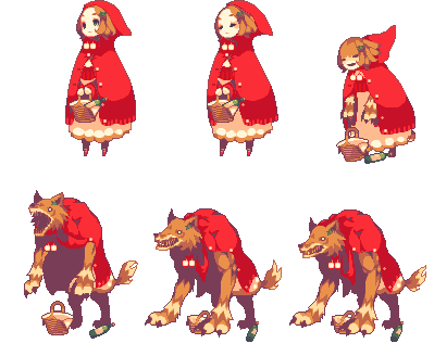
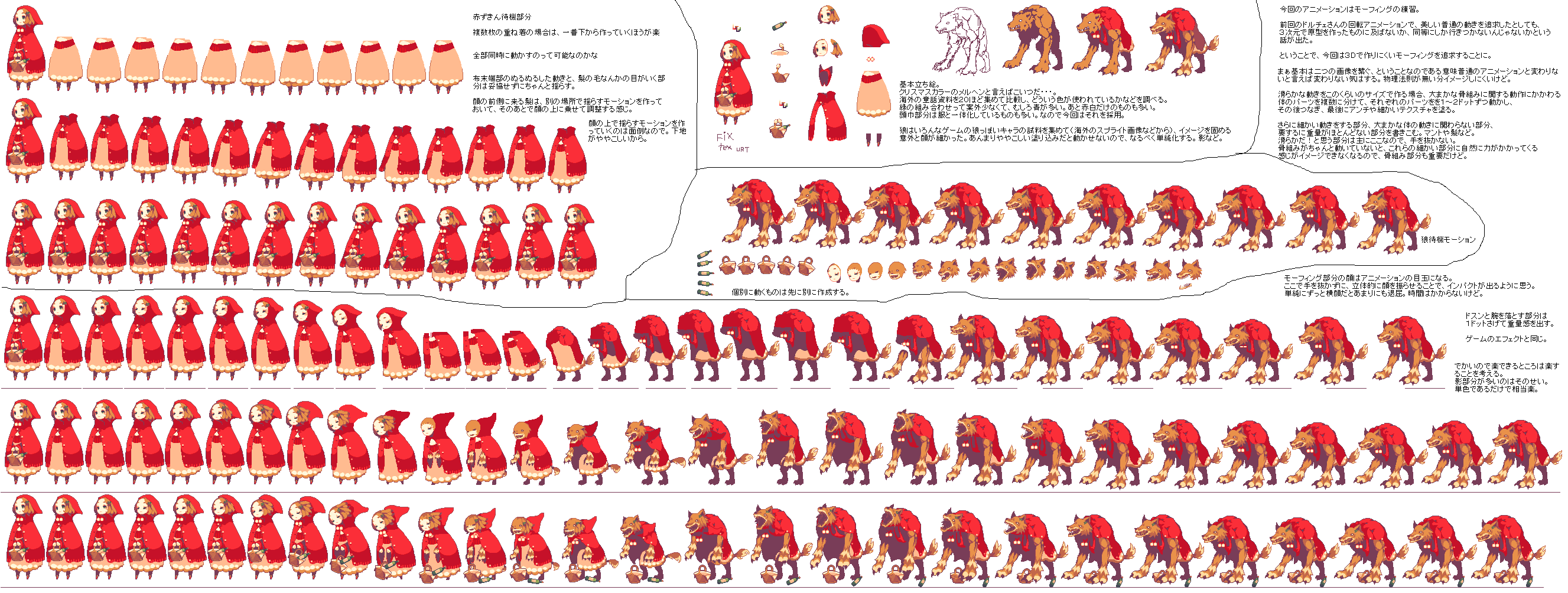
- Syosa:
This artist is like a god to me at the moment. (notice that I'm using some of his work for testing the engine)
Not only his/her pixel art is amazing, but the style and animation is just beautiful and fluid. On his website (only Japanese) he posts and explains a lot of his process which turned out to be really helpful.


His/her work is just adorable and with a very lively animation. Isometric views are his speciality, and love the way he makes little diorama-like images full of detail. 
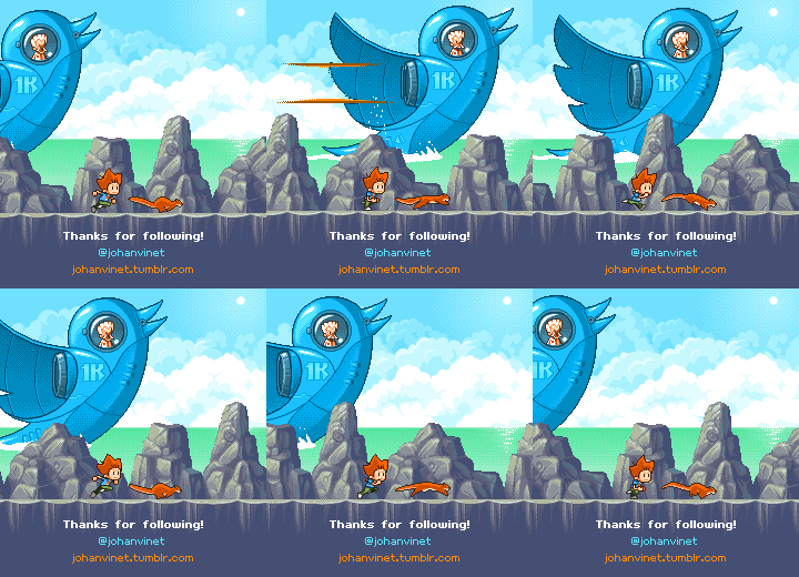
His work is fast, dynamic and very consistent. He is a very active person in different communities and post work all the time.