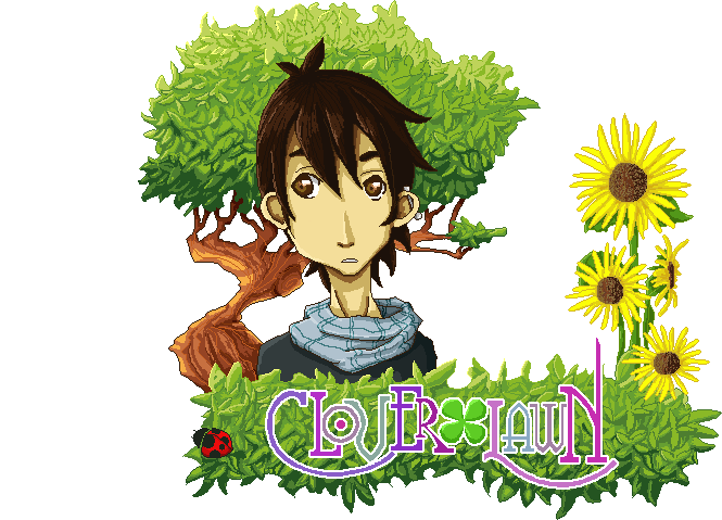
As I mention before I was basing my inspiration on some of my favourite JRPGs and for easement I wanted to go for a stylised character to avoid having to force a realistic style and end up with something with poor quality. There where loads of simple ideas like the ones below, but I wanted to go for something somehow generic or standard for the'hero'.
The image below is an idea that I got quite attached to; a guy who's hair transform into feathers. Without thinking much on the possible background of the character, it could easily fit a race/village of bird-like people. Base on this I made some variations trying to see different noses. The middle one being the 'standard' looking one and on both sides some larger and pronounced ones. I also wanted to play with colours, and because I'm quite indecisive I opted for putting the chart below online and ask people's opinion.
At the end the one that people liked the most was N2 and W3. After opting to go for the most generic face I was excited for the feathers, yet I grew soon scared of them; if it ends up animated and on a game engine they need to bounce and move as well! If the animation and physics don't work fine it will look stiff and not believable. Not that I didn't like the challenge, but the point of this project was not to kill me of over work (I think). In short, I chickened out.
At the end I went for the same face but put a short hair. not sure yet about the colour scheme for the hair, as I don't see the point of going for crazy colour as it only look good when it was made of feathers. Once I have the full body done I'll probably play around with more colour schemes.


No comments:
Post a Comment