Showing posts with label character. Show all posts

10.5.14

Meet: Alba & Kera

Alba and Kera are the two nymphs that lie in the far end of the conservatory. Alba (orange skin) is possess the power of dawn while Kera the power of dusk. Never meet each other while being free, yet once they where captured and locked up in a cell, secluded from the rest, they found out that they where in perfect sync, both body movements and thoughts. Their individual powers are unknown, but definitely strong. They've never convinced forces before, yet they can sense that it can be a powerful weapon. They rely on their voices to cast their powers with words, yet the collars implanted by 'him' prevent them from making any incantation. The cage itself also helps to keep their powers under control. The flame over their heads represents their power and emotions, yet it can't actually make anything caught fire. Ever since they've been there, they have become the main adoration of 'him' and he's been the only one that has come in contact with them. The backstory of the nymphs is unknown. 


Alba and Kera where the must fun and sexy to come up with. There where so many ideas that came to my mind, from plant like humanoids to bird-like creatures. I wanted to avoid an elf look and also a ying yang concept. They're still representing opposite entities, but at least I managed to balance it out with some colour and features like the horns. Most of the features where inspired in biblical images with the halo and the flames, yet I added some horns to Alba (but doesn't mean she's evil). Being nymphs, I couldn't come up with clothing for them, as they represent free natural spirits, so I added a massive amount of hair (although they might still be quite...  provocative). I wanted to keep them secluded from the rest of the characters; by not having much interaction with the players in the level I made them into a special characters (you can only access them near the end). Enjoyed playing with loads of colours, specially on their eyes. Hope their (almost) nudity won't create any kind of trouble...

19.3.14

Colour test: pallet

 I finally got some time to start working on the colour side of the sprite. The previous post was a test for size and it was mainly an outline and proportions of the final sprite.
I limited myself to a pallet of about 38 colours. I was originally just use no limitation, but then I thought that might be a challenge when it comes to the colouring of each frame of animation. Plus this way it looks a lot cleaner.
On the image below I have the pallet along with the 100% sprite size, a 500% version and a comparison with the concept art. Since the final artwork will look roughly the same size as the 500% one, I'm pretty happy that with the results (got scared when I saw the 100% result).
Next step before polishing the sprite is to test it on the engine. Hopefully I'll start working on other props or NPC's to try them for the next demo.


Tips for anyone that wants to try to do pixel art on photoshop: turn off any anti-alias and change preferences of interpolation (Edit/preferences/general) from bicubic/bilinear to nearest neighbour. This will help to get the pixel finish without photoshop trying to blend colours in between.

18.3.14

Starting to get 'pixely'

Today I decided to start giving it a go to what the in-game sprite artwork is going to look like, before I carry on making complicated NPCs full of detail and colour.
Obviously I wanted to test Keara first as is the main character and she will have pretty much most of the animations.
This is just a quick test of her with a pixel line, although the final sprite will feel less linebase and the pixels more blended. The hight I'm happy with is 167px aprox., mainly because the animation of the hair might vary the over all hight.
Also today I spoke to Ryan and the process of the animation will begin. He will be helping me to get a rough animation mainly for the running/jogging animation. I couldn't resist to make a quick test for the idle, which clearly needs a lot of work, but I think is a progress overall. The main movement will happen on the hair, second by the dress. Luckily the hair won't have as much detail as in the full rendered version, as hair is not one of my strong points to draw. Later on I'll start making some test with the colours applied on pixels.

Meet: Teles

Teles is a rare male siren specimen, despite de believe that they're only females. He comes from a nordic species, and in difference with regular mermaids, he posses two tails (like legs) instead of just one. He's capable to breath under and over water, but he does require constant moist for his skin to survive. His colours resemble a a japanese carp fish with bright oranges and white spots. He's often mistaken by a girl because of his fragile appearance. He was raised in a life of comfort as he was one of the few males born, therefore he was treated like royalty in his tribe.
His attitude can be a bit pedantic and childish at times, yet he tends to manage to see what people are like inside very easily. He's never had the need to do much in life, therefore he doesn't have many abilities that can help him scape. He comes from a very reserved and hostile tribe that are not very open to new ideas and traditions. This is probably his biggest frustration as he's grown with this feeling of restriction , explaining a lot of his grumpy personality. He never learned any self defence as he thought he'd never leave his tribe, so now he's stuck to what others can do for him to scape the conservatory. People in his tribe usually typically uses traditional tridents as a weapon along with their water affinities, yet he finds no desire on picking such a heavy weapon. His arms and vocal cords are sealed with magic by those ornaments, yet they don't posses much power as he's been limited to stay by the fountain.


In respect to his design, I knew from the beginning that I wanted to make him like a little prince. I got mixed feelings with his design, as some people though he was too feminine and slightly repulsive. I wanted to keep the feminine touch and gave a mix sexuality identity (hermaphrodite). Once again with the colours, I wanted to stay away from the norm (green/blue for underwater people) and still keep that colourful aspect of a fish. Also his names comes from latin american roots that mean siren, and decided to give him that name despite it being meant to be for girls. 

17.3.14

Meet: Kamea

Kamea is the protagonist of Sanctuary.   (\k(a)-mea is pronounced ka-MAY-ah). The name has Hawaiian origin which mean 'the one and only'. Just like the name suggests, she's the last one of her kind. The inspiration came from my sister and her obsession liking of unicorns, and it spins around the concept of the story called 'the Last Uniconrn'. In this case the unicorn has a more human like form, but still keeping the horn (obviously). Her tribe used to be a very passive yet powerful one; always in tune with nature and in favour of controlling wind powers.
She's 16 at the time story starts, and not so long ago she found herself running and hiding with a few other remaining members of her clan. The numbers on her clan began to decrease once the value of their horns began to raise on the black market, under the false idea that it granted eternal life.

She's a very kind person, but she's shadowed by a bunch of insecurities and complexes created after years of prosecution and  living in fear. She doubts her abilities and questions every step she takes. Tasks like taking decisions are always a big challenge for her, and she always put others in front of her own needs.

Because she spent her last few years running away, she never completed her training and her skills are far basic, compared to what the capabilities of her tribe can achieve.
Now that she's the only one left alive, she will have to fend for herself and maybe master the techniques on her own.


In respect of her design, I wanted to reflect some of my sister's qualities like the hair, height and skin colour and mix it up with loads of fantasy features. The initial concepts that I made at the beginning where helpful to ask people what their opinion was about the designs and curiously most people ended up liking the ones I based on my sis (4 and 5). Colour wise, I didn't wanted to restrict myself to a simple pallet as I was everything to be full of colour, although in the final pixel art the gradients might be a bit shaper. the golden handcuffs and the collar where placed by the magician to suppress her power, although he ignored to put a constrain in her horn (maybe he didn't see it?). I ended up playing with shadows and transformed them into crazy purple/pink light, just to play around with colours. She's got very small feet and is always walking on her toes; from far away it looks like she's got hooves.

About her personality, I didn't wanted to make her the typical 'I can do it' type of heroine nor the clumsy and funny one. Having my own insecurities, I wanted to explore and create a game that not only spins around the 'goal' of the game itself, but that evolves around a psychologically complex character and how this character would react to all the situations around. On this first level it only involves the main idea of her having to communicate to strangers (which is one of my worst enemies) and finding the courage to embark on a new adventure by getting her and the others our of there. Will she be able to make it?

More characters to come soon... 

17.1.14

Finished Character

So the day of submission comes and I'm sort of done with the practical. As always there's a lot of room for improvement but here's the over all of the project. 
I'm not entirely happy with the end result; some of the aspects that I would like to work more on is the textures (specially on the hair and eyes), good rig, blend shapes and some animation. 
I did manage to rig the character, but got stuck on the weight painting as I managed to lock the weights and I wouldn't modify it... probably did something wrong buy it was taking me a lot of time to fix it. Blend shapes seemed pointless if the character was in a still position. 
For the textures, it's harder to make them than it looks; on Maya they look one way, Unity3D another and UDK another. The hair look fine on Maya but the eyes didn't and the other way around on UDK. It becomes a bit of a try and error, quite time consuming. Next time I'll be trying the textures only on the final engine that it will be render at. 

Speaking of engines, quite disappointed at Unity at the moment and really looking forward of learning some UDK. The quality of the real time render is far superior on UDK and it pretty much makes everything look pretty. This is the final video for the turn table of Arnold. It was done real time, I just capture the screen video.

The baking of the normals are not perfect, this is the first time I've try Zbrush, topogun and xnormal, so there's a lot to learn, but I'm really happy that I finally got to try them and lose the fear of their interfaces. Next time, I'll work on separate parts of the body and bake separate normals. Also I'll avoid making a single mesh for the entire body, it would probably been easier to keep different polygon count on each part. 
I really like the process and it's fascinating to see how many changes can happen as you go along, depending what works best on paper and what works better on 3D. Looking forward to polish this and make new ones, but faster this time. 
Any feedback would be more than appreciated. 

Hand in time! 


7.1.14

Clothing details

After spending weeks and weeks focusing in getting the face right I noticed that the body was made, but not polished at all.
I started re-sculpting pretty much everything because by this point I was more used to zbrush and its interface. 
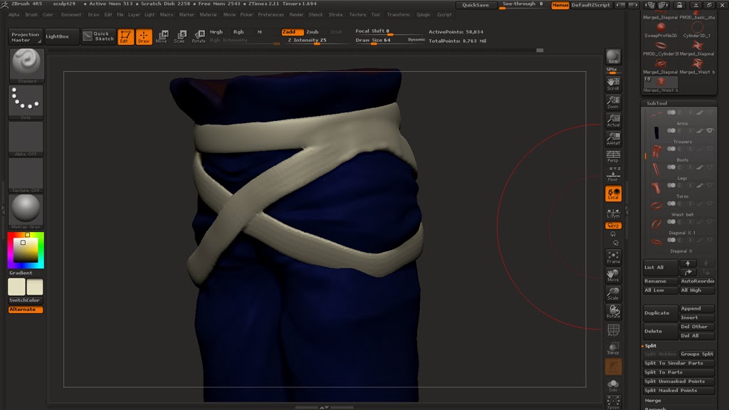
I started to get some ideas of the type if materials I wanted for each part of the clothing but because I really wanted to go into detail I had to look for close up references of stuff like the type of stitching and seams I wanted to go for. I found that a good place to look for this kind if references where clothing shops online where you can not only see every angle, but you can also zoom in when you place the mouse over (pretty much I used YesStyle).
For the top vest I wanted it to be all leather with some 'cushion' parts on the sides. The logo I've been using to 'brand' my project is an eagle-type logo which I want to include somehow in the clothing so I'll probably put it as a decorative symbol in the back. 
Something I realised I didn't took in consideration when I originally drew the design was "how is he going to take the best off?". Not that he will, but part of the topics I wanted to touch on my essay was the believability so I couldn't let this little details pass by. I had to add an extra feature on the front where he could tide it up. Didn't go for a zipper because of the style I wanted to achieve so I used laces as if it was a corsette. 
Things that I never thought I've be looking up such as types of stitching for different kind of materials certainly became a priority. This only made me realise how little attention I've been paying to my surroundings.
At this point I also discovered a very easy technique to simulate cloth within Zbrush that I will probably be using for the baggy shirt. Also the boots required a bit of attention as the integration of parts of metal weren't so common to find in other items. 
I thought that adding the details was going to be laborious and repetitive, but luckily is incredibly easy to work out how to create stencils, brushes and alphas that can convert the stylus into a sewing matching :)

These are some screen shots of the details on most of the clothing. The next process will be retopologyising everything (probably everything in one single mesh). Hopefully the details will look good on the normal maps.
Vest:


Straps: (I had to retopologised them early on to get the sharp edges). 


Gloves: I added some extra details that weren't on the original concept 


Shirt: 


Boots: I didn't like the original concept at, so before I took it to any details I ended up changing them pretty much entirely. 


This is the detail on the back of the vest. I'm planning to use that 'eagle' as the logo of my project.


These are not final colours, it was just to block out the groups and get a rough idea. Polypaint is not something I planned to do as I'll be working manually on the textures after the UV's have been made. 


30.12.13

Hair styling in 3D

Trying to get at least the head finished for one of the poster critiques, I started thinking about making the hair. For a ease of mind I did a quick one on Zbrush to avoid looking at a bold head all the time. It was quick and frankly... awful, but at least I had an idea of what I was going for.
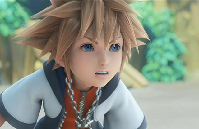
I decided to go for a more final fantasy look by making planes with textures and transparency rather than going for geometrical hair. This last one was used in games like kingdom hearts for the main character (Sora ) on game play, but not for the cinematic


Technically speaking I wanted to get an end result like this:

At this point in time the texture still a work in progress as I want to give it requires a lot of attention and I'm currently battling between engines (Unity and UDK).
So far I've created a few simple brushes in photoshop that will help me get hair lock-like strokes


Something that I never really considered much is the fact that my character's got two colours of hair (of course) the top part is blond and the bottom one is dark brown. This reduced my texture space quite significantly but hopefully I'll be able to achieve good quality of with specualr maps.

9.11.13

Character Design - ideas and colour

As I mention before I was basing my inspiration on some of my favourite JRPGs and for easement I wanted to go for a stylised character to avoid having to force a realistic style and end up with something with poor quality. There where loads of simple ideas like the ones below, but I wanted to go for something somehow generic or standard for the'hero'. 


The image below is an idea that I got quite attached to; a guy who's hair transform into feathers. Without thinking much on the possible background of the character, it could easily fit a race/village of bird-like people. Base on this I made some variations trying to see different noses. The middle one being the 'standard' looking one and on both sides some larger and pronounced ones. I also wanted to play with colours, and because I'm quite indecisive I opted for putting the chart below online and ask people's opinion.
At the end the one that people liked the most was N2 and W3. After opting to go for the most generic face I was excited for the feathers, yet I grew soon scared of them; if it ends up animated and on a game engine they need to bounce and move as well! If the animation and physics don't work fine it will look stiff and not believable. Not that I didn't like the challenge, but the point of this project was not to kill me of over work (I think). In short, I chickened out.

At the end I went for the same face but put a short hair. not sure yet about the colour scheme for the hair, as I don't see the point of going for crazy colour as it only look good when it was made of feathers. Once I have the full body done I'll probably play around with more colour schemes.

5.12.12

Colours of a robot

UV mapping Albus was more than a challenge, it was just time consuming. having all the little pieces separated made it easier, but still it took longer than what I expected. 
Most parts went out smoothly, but having to model the environment and UV map it at the same time made me not to be able to texture Albus until really late stages of the project. 
Also it was really hart to think of a colour that would suit him, and me being not so good with colour theory I ended up opting for a "typical" bronze scheme. 

Here's some of the progress images of Albuss texture: 

1.- just the UV map capture. 
 2.- The textures finally painted...took me ages to do it and I also put a small clover as a signature :)
3.- This is just an example image of the final render of Albus. Looking great and so happy :) 

This is just an idea that I thought could work (if we had more time). I wanted to make an occlusion render pass to the textures that would add a nice feeling to the textures, and probably help to give us a cartoon style with a bit of more complexity, but unfortunately this was just an attempt  the process was becoming a bit more complicated that what I expected, and it had to be done to every single object in the scene, so probably the rendering time would have double and the time for the deadline was just upon us. 


The concept of Albus


The character that I was in charge of modelling was the main robot. My initial idea was to make a "female" robot. Something that is not massively done, feminine, and agile.
By decision of the majority of the group we decided to stick to the "male" version of it, and we had ideas of different sizes and possible functions to it. Part of what we plan from this point was to just give it one arm; some point of focus that would cause it to be shut down and that the purpose of its function or existence would be part of the plot. For all we know we could have a massive cannon arm or shifting weapons that could lead to a very playable and dynamic game. 

                   
Also, being a steam robot that would ignite with a wind-up key give the main girl the connection, dependence and importance to another lever: he depends on her.
From this point we decided we wanted something way bigger than her, friendly looking and we like the idea of it having the a big tank on his back. From that point we came up with the final design of him.
This became his final concept. Here's and early stage of what could have been the first moment of interaction with the girl. Also we came out with names for both characters; the girl would be Tabitha and he would be A.L.B.U.S. (Automatic Lifting Bipedal Unit Solution)    

15.10.12

Creation of an Alien

So getting back into Maya, our exercises now is to model, UV map, rig and animate an alien based on a reference t pose that we all got.
We also got some pictures that gave us an idea of how a good topology should look like for this model (mainly because there's not one definite solution).

I think the hardest part for me is to actually begin. After losing the fear of making mistakes I pretty much modelled the half of the character without too much trouble.
There where a few places where I had to go over and over. I was trying my best to get my head around the junctions like elbows and knees where animating could become a problem if it wasn't done properly.
I suppose this is what scares me the most: Having done a lot of work just to find out that I've done something wrong and having to go back and redo it. More than laziness I believe is something irrational about insecurities. I hope I can get over that in the future, but at on the bright side, I think I'm paying more attention to many details as I go along and learning to spot mistakes in earlier stages. (I have to the take out the positive of EVERYTHING) 


After that I just mirrored the geometry (fix some minor issues with the crotch) and VoilĂ ! we got a decent looking alien. It looks much better on the smooth version, but as long as it works along with the rigging the I'm happy about it.

After that and creating the bit of the inside of the mouth, I then moved to UV map it. Because of the Russian dolls project I feel a bit more familiar with UV mapping and I didn't struggle much other than splitting the head while maintaining the ratio of the eyes (for as bad as that sounds). 
It isn't mandatory to give it a texture in specific, as all that matters is to have a rigged and fully animated character by the end of this exercise, but I might give it a go just for the sake of it.