Showing posts with label concept art. Show all posts

10.5.14

Meet: Edric

Edric is a british dragon with an incredible amount of power. The only way to seal his power was with the power of a magic sword that pierces his mouth. His not the smartest creature out there, and he's not good with words, but normally he's a docile and noble creature. He's the first one to come in contact with Kamea, and luckily for him, she doesn't miss judge him based on his looks. He manages to encourage Kamea to explore around while hoping to free himself and get revenge on the one that got him captive. 


His initial design was always a big creature in relation with the rest of the characters, I probably never got to a point where I came up with the entire design of the body as I knew for this level only a small part was going to be shown. The idea of him being nice and docile was always appealing, trying to break the idea of judging character by how they look. Normally he would be put as a cold beast fighting against the 'good guys'. I tried to go for different colours like blue, green and black, but ended up going back to a more 'classic' red colour and with scales. Made the blood blue to make a high contrast and make it look like he's constantly bleeding as he tries constantly to escape. He's one of my favourite characters, as I can imagine him being like a big body guard for Kamea. Happy with the end design, shame I didn't have the time to draw the rest of his body. 


26.3.14

Some pixel art process

In my previous post I mentioned a blog that had a compilation of some 'rules' with regards the creation of pixel art. 
The type of pixel sprites that I'll be doing for the game are relatively big, and the level of detail is high in comparison to initial pixel art where characters could have a 24x24 sprite (like the old megaman games) to a more detailed 150 pixel sprite. 

I've documented the initial part of the process of the creation of the sprites of one of the elements that I like the most: the fountain of the Harpy.
The idea started as a sketch where I added some watercolour, but this was just to give me an idea (and play with watercolours for a bit). I scanned it and modify the background, mainly just to make it easy to work with. 

Then I made it semi transparent and using the pencil tool and preferences that will help me to keep hard edges in case of any movement or modification. I start with a very loose line, mainly just following the contour, as if I was to redo the line work. 


After all that is finished then I can turn off the reference and go into detail to fix the line. The image below is the outcome of a quick line. 


The image below is the how it looks after cleaning up, the idea is to avoid having any overlapping pixels. This will give an effect from further as a clean curvy line. This could be one of the processes that take the longer as is a matter of individually erasing and painting pixels all over the line. At the same time, you need to be zooming in and out to make sure the line is taking the shape desired, as is very easy to get it to look wonky...and in fact sometimes is just hard to correct and can only be corrected once the rest of the solid colour is along. 


This is the difference between the quick first line and the final clean up. This 'rule' wont apply everywhere as the hand that's suppose to be closer I decided to make its line thicker mainly to use a comic like technique of line weight. 


After that I started blocking out colour and shadows, which roughly follows the idea of cellshading with hard edges on the change of each colour/ shadow, this is mainly to give a sharp contrast and help the perception of the shape. In this case the statue is some sort of plaster material with its own shadows, while it will be cover with mould due to the dampness. Eventually I'll add the water falling down. This process is not finished as the shading requires just as much work as the line work. Also the main line will have colour and will nicely blend along with the rest of the colours. This kind of big landmarks on the level need to be very detailed, in comparison to the rest of the props, so I'll keep posting some of the further finished props as I go. 


17.3.14

Meet: Kamea

Kamea is the protagonist of Sanctuary.   (\k(a)-mea is pronounced ka-MAY-ah). The name has Hawaiian origin which mean 'the one and only'. Just like the name suggests, she's the last one of her kind. The inspiration came from my sister and her obsession liking of unicorns, and it spins around the concept of the story called 'the Last Uniconrn'. In this case the unicorn has a more human like form, but still keeping the horn (obviously). Her tribe used to be a very passive yet powerful one; always in tune with nature and in favour of controlling wind powers.
She's 16 at the time story starts, and not so long ago she found herself running and hiding with a few other remaining members of her clan. The numbers on her clan began to decrease once the value of their horns began to raise on the black market, under the false idea that it granted eternal life.

She's a very kind person, but she's shadowed by a bunch of insecurities and complexes created after years of prosecution and  living in fear. She doubts her abilities and questions every step she takes. Tasks like taking decisions are always a big challenge for her, and she always put others in front of her own needs.

Because she spent her last few years running away, she never completed her training and her skills are far basic, compared to what the capabilities of her tribe can achieve.
Now that she's the only one left alive, she will have to fend for herself and maybe master the techniques on her own.


In respect of her design, I wanted to reflect some of my sister's qualities like the hair, height and skin colour and mix it up with loads of fantasy features. The initial concepts that I made at the beginning where helpful to ask people what their opinion was about the designs and curiously most people ended up liking the ones I based on my sis (4 and 5). Colour wise, I didn't wanted to restrict myself to a simple pallet as I was everything to be full of colour, although in the final pixel art the gradients might be a bit shaper. the golden handcuffs and the collar where placed by the magician to suppress her power, although he ignored to put a constrain in her horn (maybe he didn't see it?). I ended up playing with shadows and transformed them into crazy purple/pink light, just to play around with colours. She's got very small feet and is always walking on her toes; from far away it looks like she's got hooves.

About her personality, I didn't wanted to make her the typical 'I can do it' type of heroine nor the clumsy and funny one. Having my own insecurities, I wanted to explore and create a game that not only spins around the 'goal' of the game itself, but that evolves around a psychologically complex character and how this character would react to all the situations around. On this first level it only involves the main idea of her having to communicate to strangers (which is one of my worst enemies) and finding the courage to embark on a new adventure by getting her and the others our of there. Will she be able to make it?

More characters to come soon... 
6.3.14

Quick introduction to the characters - initial concept art

The ideas I came up with Sanctuary started just as a way to merge my interest in stylised imagery and fantasy, creating a pleasant looking game. After working on the conceptualisation on the main character and some of the principal NPC, I started to reflect some of the personalities of people around me, and even more I started reflecting some of my own personal problems into the characters. 
Without going too into detail or to literally just make a fantasy version of my friends/family, I started creating some personalities for each character. This initial level that I'll be working on, only compels the escape and intro of the potential game. The NPC's that appear here are not necessarily going to be playable characters, but if the project was to go further, I would certainly want to give them an important role in the story. Pretty much all their personalities clash; each character will posses not only a determined personality, but they will have their own insecurities, concerns, strength and weakness. The main character will be an unusual hero type, as I want her to be the one who experiences the world and her task while dealing with insecurities and anxieties about herself. 
Loneliness is a key concept here; each NPC is the last one of their type, and this is the 'quality' that will unite them as a 'family' later on. 
Once I finish each of the characters final art, I'll go in depth on their personalities, in the mean time, here's some of the initial concept art: 

Kamea: The main character of the story, unicorn.


Alba & Kera: Dawn and dusk nymphs.

Teles: The male nordic siren 

Azmer: The Centaur/Wemic
The dragon (working on name)

This is just quick ideas for the 'bad guys'. I thought of rabbits/hares well dressed, as they're serving a rich and powerful wizard. Also wanted to play with the idea of some of them just not caring about their jobs and not being aggressive... this guys might not be on the final level, as I'm not entirely sure if I'll be able to put a battle system. 


14.12.13

Clothing design - collaboration with Sarah

From all the ideas I had at first for the character I couldn't come to a finalised design for the clothing. I knew I wanted to get a look a generic RPG which usually implies some sort of fashionable combat outfit. Materials like metal and leather are frequently used, and wanted to keep it simple for potential extra details.
I made some initial ideas, but I wasn't happy with the over all feeling.


Sarah Hatton was kind enough to help me out and she drew 3 outfit options for me. At the end I chose to merge them into one choosing a my favourite features from some of them.


The shape is meant to be simple and light on movement as the character wields twin swords and agility is his main feature. At this point I haven't design those swords but hopefully I'll get down to do them soon. 
Also I'm hoping modelling clothing on zbrush is not overly complicated so that I can add extra details.
This images below are some of the ideas for the fabrics that I had in mind; the idea of having a medieval-like style with leather and baggy areas of cloth.


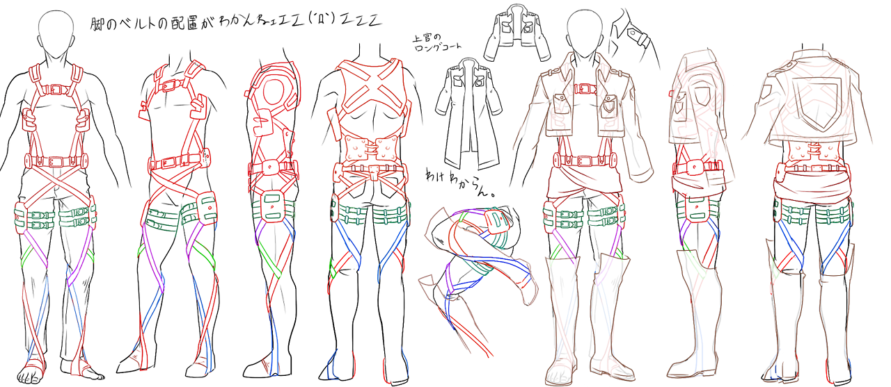
Also for the legs I couldn't resist to add some features from a series I'm watching called Attack on Titan or Shingeki no Kyojin in Japanese (進撃の巨人). The series itself takes part in an alternative reality where humans are evolving in a different way, and despite having some sort of rudimentary technology it seems force to be stuck in some medieval stage due to Giants attacking all the time. Something they wear to attack this giants is a weapon called 3D gear and it is attached to the body through a series of straps all over the body. I used something similar (in smaller scale) to attach the back compartment of the twin blades. 

9.11.13

Character Design - ideas and colour

As I mention before I was basing my inspiration on some of my favourite JRPGs and for easement I wanted to go for a stylised character to avoid having to force a realistic style and end up with something with poor quality. There where loads of simple ideas like the ones below, but I wanted to go for something somehow generic or standard for the'hero'. 


The image below is an idea that I got quite attached to; a guy who's hair transform into feathers. Without thinking much on the possible background of the character, it could easily fit a race/village of bird-like people. Base on this I made some variations trying to see different noses. The middle one being the 'standard' looking one and on both sides some larger and pronounced ones. I also wanted to play with colours, and because I'm quite indecisive I opted for putting the chart below online and ask people's opinion.
At the end the one that people liked the most was N2 and W3. After opting to go for the most generic face I was excited for the feathers, yet I grew soon scared of them; if it ends up animated and on a game engine they need to bounce and move as well! If the animation and physics don't work fine it will look stiff and not believable. Not that I didn't like the challenge, but the point of this project was not to kill me of over work (I think). In short, I chickened out.

At the end I went for the same face but put a short hair. not sure yet about the colour scheme for the hair, as I don't see the point of going for crazy colour as it only look good when it was made of feathers. Once I have the full body done I'll probably play around with more colour schemes.

6.3.13

Spaceship - Concept

Having eyes as a big part of the story I wanted to keep the concept to the extend to make it into my spaceship.
Eyes can be beautiful, but with the right movement and perspective it can become something sinister and scary. 
I remember watching something similar on an anime called 'Neon Genesis Evangelion' in which 'Angels' were creatures trying to cause and apocalispse ... (or something like that) 


One of them morphed into various things and most of them where eye-like shapes. 

I have a certain aversion with technological and stereotipical sci-fi at the moment, so I wanted to make something more organic, and at the same time something abstract.

The of the outside of the spaceship is for it to be constantly moving in all direction, as if it was scanning things quickly. A massive eye that appears through the clouds and starts staring and analysing  down on society. The core of the spaceship is hidden behind a series of screens and moving lights at different levels, making it look as if it was made of transparent layers.
I found it hard to make it look as scary as I portrait it in my head, but hopefully the movement brings a different perspective of it. This is the concept I made for it:


The inside of the spaceship still a bit unsure. I'm thinking of something organic and dark. I dont want to get too much into details for the inside as my plan is to focus on achieving a good level of quality for the alien.
My inspiration for it so far is fractals. I love the composition that can be achieved with simple algorithms. I found loads of inspiration but mainly looking for architectural driven ones.


First concepts

Before we went on Christmas holidays I knew I needed to hurry up and start working as soon as possible to avoid making the same time managing mistakes as the last project so I came straight to the idea of wanting to make the last scene with a bit of a spice. With this I mean that the alien I have in mind has to be a sexy or very feminine type.
The idea is that when the photographer get abducted he'll find himself I front of a non human yet good looking space form of living. The inside of the spaceship will be quite dark but what he can see he finds attracting. As soon as he tries to make contact he'll notice that it wasn't what he expected.

There are loads of examples I could find in games of feminine monster/boss that fit the sort of description that I want to my character.
For it to be attracting it has to share some similarity to human features and specially the ones men are attracted to.
With this in mind I came up with the idea of a space mermaid; a creature that lures man with its beauty but has not good intentions.
This is tan inspirational moodboard of examples that I found in games I've played.

Also, over the Christmas holidays I went to the beach got really inspired by all the sea life. Coral reefs, lion fish, manta rays and many other textures gave the idea of some possible looks for my space mermaid.
This is the moodboard of some inspiration for colour, texture and shapes:


Loads of doodles gave me two tentative options for my ending:
-The first one, he only sees the part above the waist as he rest is in the shadows, then he freaks out when she comes out and she has the lower anatomy of a crap like creature.


-the second one she is like an angel until he discovers that she is the bait part of a bigger creature. At the end a massive eye behind her opens indicating that the ship itself is the the massive real creature and that she was and 'organic' weapon made to lure man.

At this point I don't know which one is better and how mad I'll go when I try to make any of them.


This is the final storyboard:


5.12.12

The concept of Albus


The character that I was in charge of modelling was the main robot. My initial idea was to make a "female" robot. Something that is not massively done, feminine, and agile.
By decision of the majority of the group we decided to stick to the "male" version of it, and we had ideas of different sizes and possible functions to it. Part of what we plan from this point was to just give it one arm; some point of focus that would cause it to be shut down and that the purpose of its function or existence would be part of the plot. For all we know we could have a massive cannon arm or shifting weapons that could lead to a very playable and dynamic game. 

                   
Also, being a steam robot that would ignite with a wind-up key give the main girl the connection, dependence and importance to another lever: he depends on her.
From this point we decided we wanted something way bigger than her, friendly looking and we like the idea of it having the a big tank on his back. From that point we came up with the final design of him.
This became his final concept. Here's and early stage of what could have been the first moment of interaction with the girl. Also we came out with names for both characters; the girl would be Tabitha and he would be A.L.B.U.S. (Automatic Lifting Bipedal Unit Solution)