30.12.13

Hair styling in 3D

Trying to get at least the head finished for one of the poster critiques, I started thinking about making the hair. For a ease of mind I did a quick one on Zbrush to avoid looking at a bold head all the time. It was quick and frankly... awful, but at least I had an idea of what I was going for.
I decided to go for a more final fantasy look by making planes with textures and transparency rather than going for geometrical hair. This last one was used in games like kingdom hearts for the main character (Sora ) on game play, but not for the cinematic


Technically speaking I wanted to get an end result like this:

At this point in time the texture still a work in progress as I want to give it requires a lot of attention and I'm currently battling between engines (Unity and UDK).
So far I've created a few simple brushes in photoshop that will help me get hair lock-like strokes


Something that I never really considered much is the fact that my character's got two colours of hair (of course) the top part is blond and the bottom one is dark brown. This reduced my texture space quite significantly but hopefully I'll be able to achieve good quality of with specualr maps.

28.12.13

UV layout

When it came to the part of UV mapping I did the simple shapes like the eye easily in maya; the inside of the mouth was more difficult, but also managed to do it.
It was when I did some attempts of unwrapping the face where I realised that I needed help form a different software.
In the multiple tutorials I looked at, some people mentioned UVLayout as a good tool for unwrapping, so I decided to give it a go. Just like in Zbrush, the interface was pretty unique but luckily for me, a simple 10 min tutorials gave me the basics to start exploring on my own.
Once you get the hang of how to select edges, create seams and flat the UV projections everything else becomes quite intuitive.
One of the main features I really liked about it, is that it not only give you an indication with pattern textures of where the stretching or squashing is happening, but it also gives you an indication colour based where green is good, red is overly stretched and blue is squashed. This becomes really handy for when you want to fix thing manually as you can tell where to move the UVs and if your movement has affected another texture face.
Probably with a bit more of practice I can manage to get the hang of it more efficiently, but for this matter I'm quite happy with the results and highly recommend people to use it :)


22.12.13

Extended Essay update - Poster

As part of the last group update about our process in the extended essay (aka Dissertation) we had to make a poster. I was hoping to have the head completely finished by then, but I never took in consideration the amount of time it would take me to put hair.
Here is my final poster (warning: big file)

I didn't get much feedback about my project or the process it self; mainly they where ideas of how to present future posters (?) and to guide the reader with arrows to establish that it is a pipeline and make it easier to understand which steps follows which.

14.12.13

Clothing design - collaboration with Sarah

From all the ideas I had at first for the character I couldn't come to a finalised design for the clothing. I knew I wanted to get a look a generic RPG which usually implies some sort of fashionable combat outfit. Materials like metal and leather are frequently used, and wanted to keep it simple for potential extra details.
I made some initial ideas, but I wasn't happy with the over all feeling.


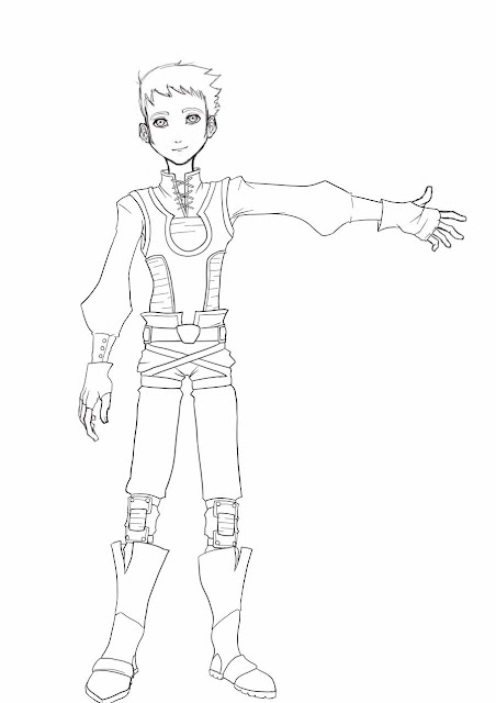
Sarah Hatton was kind enough to help me out and she drew 3 outfit options for me. At the end I chose to merge them into one choosing a my favourite features from some of them.


The shape is meant to be simple and light on movement as the character wields twin swords and agility is his main feature. At this point I haven't design those swords but hopefully I'll get down to do them soon. 
Also I'm hoping modelling clothing on zbrush is not overly complicated so that I can add extra details.
This images below are some of the ideas for the fabrics that I had in mind; the idea of having a medieval-like style with leather and baggy areas of cloth.


Also for the legs I couldn't resist to add some features from a series I'm watching called Attack on Titan or Shingeki no Kyojin in Japanese (進撃の巨人). The series itself takes part in an alternative reality where humans are evolving in a different way, and despite having some sort of rudimentary technology it seems force to be stuck in some medieval stage due to Giants attacking all the time. Something they wear to attack this giants is a weapon called 3D gear and it is attached to the body through a series of straps all over the body. I used something similar (in smaller scale) to attach the back compartment of the twin blades. 

10.12.13

Hai Phan - Freelance Character Artist


Hai Phan is an artist I came across when I was looking for tutorials that involved the entire pipeline. It was in CGCircuit that I found his videos and the fact that he wasn't going for a realistic approach but rather a really nice stylised that made it so appealing. 
His tutorials were helpful as he didn't approached a software specific but rather explaining the general concept and industry standards. 
Hella is the character he mainly worked with and it was amazing to see most of the process on the making. 
His portfolio is fascinating and quite extensive (have a look!); the amount of different characters and creatures that he creates varies a lot yet you can still sense a style within. 


Not only his videos were really accessible but it was really easy to get in contact with him and he was kind enough to answer some questions that will be useful as primary research for my dissertation. 


4.12.13

got a job!

I GOT A JOB!!!!!
as a game artist