7.5.12

Eternal Sonata

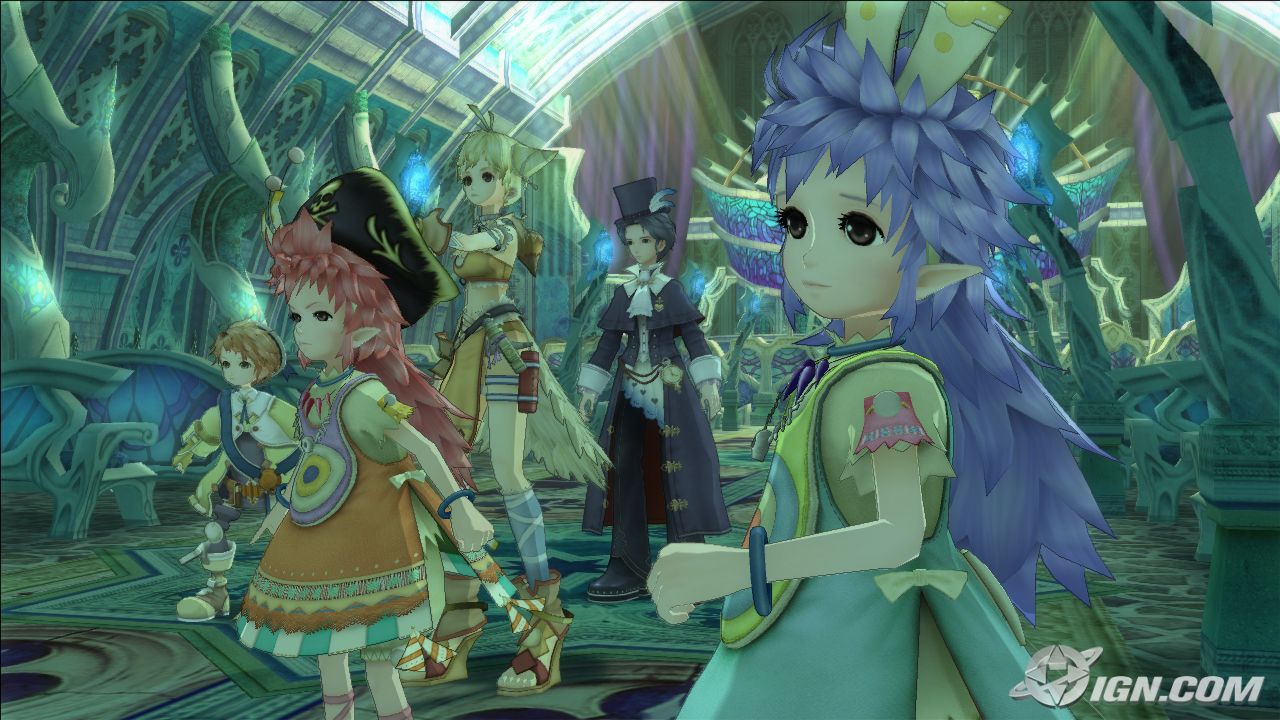
As part of the result of my compulsive eBay-biding face I got my hands on Eternal Sonata by Namco Bandai for the PS3. 
As a single-player RPG that I usually go for, this one has a strong anime style which I think goes really nice with the cel-shading graphics and despite the weird plot that spins around the story of the pianist and composer Frédéric Chopin and a fantasy dream that happens just before his death, the graphics of the game is what capture my attention. 
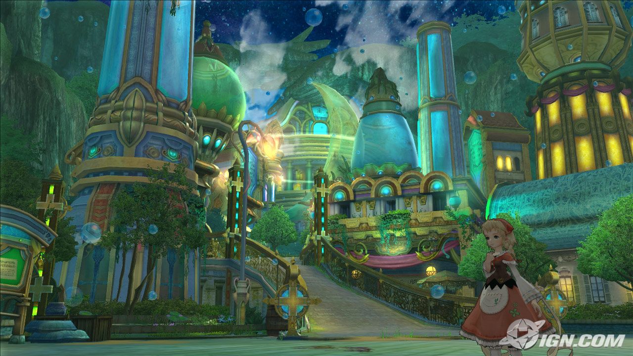

After I started playing it I discovered that the amount of detailed they put on the scene was absolutely fantastic for its style. It's good to see some games stepping aside from the dark realistic graphics once in a while, and this one features an incredible well use of colour the whole time. 
The game itself is based around musical features, so the sound design is well appreciated for someone with some musical background, although I naming the characters after music styles is a bit too much (I mean, come on! Polka, Salsa, Allegreto...really?) 


I heard bad reviews about this game, but to be fair I haven't found anything wrong with it, and in fact I think it has a decent level of difficulty and I really hope it carries on like this. (I haven't finished it yet) 
Might not be everyone's cup of tea, but I certainly helped me to carry one with my scene and inspired me to work more on my detail levels. 


Journey

If anyone asked me to describe the latest game developed by the famed-indie studio thatgamecompany, Journey I would say: Deep.

Ever since I saw the trailer for it I became curious about this title, reasons being the fact that it's only a 3 hour game, no status bars, no "bad guys" or monsters and narrative based on images (no text through the game or voice at all).
After downloading it from the PS Network I started the game and there you are; in the middle of the dessert with no one to tell you what to do or where to go, on the distance a mountain with a bright light on the top.
Regardless of this, and with out spoiling anything important, the game posses a very clear plot, but it is something else that captivate me all the way until the end.
I believe that Journey is a tale of devotion, persevarance that shows you the power of determination and the cyclical continuity of life.
With a fantastic online feature, as long as you have internet access, the games automatically puts another player along your side (randomly) so the feeling of not being the only one in the whole world seems to be shared between two, but saying this, the only way of communication is a single-note whistle. Might not sound like much, but I couldn't believe how "attach" you can become to a complete stranger that follows you along side your journey.
Deep...

Graphically speaking, and despite the minimalistic style of the game, the whole scenario and levels of the games are an orgasmic feast for the eyes (seriously). The feeling of a boundary-less vast world rarely changes and you get straight away the idea of being in a unique post apocalyptic world that yet is gorgeous.

Sound wise... I'll just say that I'm eagerly waiting for the soundtrack to come out; already pre ordered...that's how good it is.

Certainly Journey quickly became one of my favourite games of all times. I hasnt come out of my head and I'm eagerly talking about it to everyone, yet no matter how many time I try to explain it, it just doesn't sound nowhere near as how good the game actually is.
It might be just me who got obsess with it, with the concept, with the music, with the playability and re-playability, and it might be just me who gets really attached to games that go deeper into the user's emotions, but I'm sure that everyone can fit the game to more than one episode of their lives and therefore make of this 3-hour experience into a unique journey.


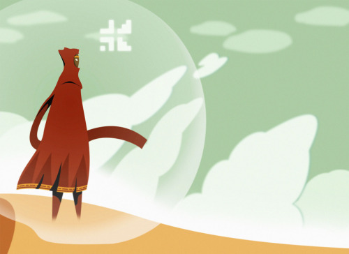
(It even inspired me to do some fan art lol ... still working on it) 


5.5.12

Some progress IV...or not...

After trying my best on drawing the textures for the altar, I realised that all my effort for getting a nice looking UV map was pointless. because of the size of the object and the amount of detail needed it was too hard to draw on the edges and make the texture look smooth and fluent.
This was my previous uv map:

At the end, and because of lack of time, I had to use an automatic UV map just to use the separate feature. I feel guilty for having to turn to this option, but time is running out, and got a lot more to texture...
This is the final UV map :(    not looking good, but its being a lot more easy to texture.


1.5.12

Some progress III

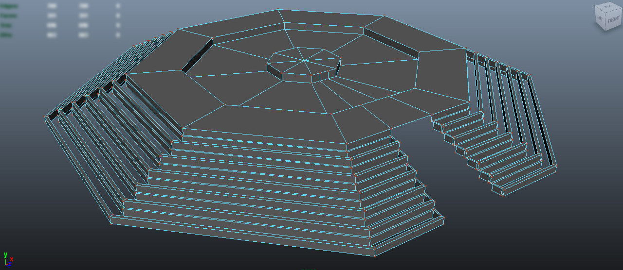
The sacrifice altar wasn't difficult to model at all. Having a basic structure and thanks to some good planning I manage to do it in no time.... ....
ok, that was a lie. 
I did struggled at the point where I had to do the diagonal stairs. Because of my intentions of trying to make everything look huge I had to do the staircase relatively close to a normal stair size, meaning that I had to LOADS of stairs and that diagonal shape on the ends did not help to make it any easier.

the fun part for it was also the UV mapping, because, as usual, didn't put it in consideration when building it so, after detaching a few pieces I manage to come up with something easy to work with. 

For the snake pillars I struggled less since I had a better plan for it. Using some references I place some planes that made my modelling more precise. 

 So now pretty much the main structure is there.
Because some work what I've been doing with some flowers (I'll post about that later) I decided to all the textures by myself, so wish me good luck texturing all this.

30.4.12

Some progress II

After loads of attempts of trying to get Mudbox running on my laptop and nothing good, I decided to give it a try to Zbrush. My plan was to make the stalactites and stalagmites in high poly and then capture the details on a normal map. The product was quite good looking, but I think I spent so much time trying to get this level just for one piece and thinking of the amount of pieces that I needed to make it look decent. 


At the end, and after spending so much time looking at tutorial after tutorial, I decided to just edit one big mesh and make it look as good as possible with a tileable texture. much more easier as Zbrush does the complicated UV mapping for you and it's really easy to export back to Maya once you set it up. After running a decimation to avoid killing Maya on the attempt to export an object with over 1 billion polygons, I got quite surprise that it changed from quads to triangles... never worked with them and my previous 3D professors where completely against working with them. 
Didn't care...
So manage to get the normals working and to get it all fit and scale with the rest of the scene. So far is the object that's spending most of my poly-budget, but hopefully will be worth it. 
I still want to play more with Zbrush, since it's a really different software, that quite took me a while to get my head around, but seems like one of those in which I can see myself getting lost for hours just trying and trying all the tools. 
After duplicating the half of the cenote (cave) on which I worked on, and merging them together I saved and closed Maya, but is until now that I noticed that by doing that I completely destroyed the UV map and it was turned into a square, so now I either work with an automatic UV proyection or start working on a uv mapping of an object that has over 67,000 polys and loads and loads of organic bumps. God save my soul if I chose the second option. (which I probably will) 

17.4.12

A Pulse of inspiration

While thinking for some inspiration for the style of my game environment, I certainly look at many kind of games just to give me an idea of the level of details.
Even though I know that Unity can export games to many platforms, I decided to look at PS3 references (since I can always "experience" it for myself.

While playing the game, Final Fantasy XIII became a strong influence in the process, and more because of the pretty cinematic, it's because of the detailed and beautiful work Square Enix has done with most of the scenarios. More than looking at the high-tech ones, I focused on a part of the game called Pulse (Just got there, took me ages!)   


This image above is the concept art for it. Full of details and breath taking I would say. Knowing the company they could make part of the cinematic in this kind of scene and make it look surreal, but is it going to look just as nice inside the game?


For me...I think it does. I spend some time (while levelling up... this is a good harvesting area) looking at the flowers, rocks and cliffs, plants and little details that normally I wouldn't notice for the urge to go and kill the next monster. This made me realize that for game engines, you cant just expect to spend ages modelling everything perfectly, but spending time on the textures, that's what makes the difference.

I started looking more and more at the concept art and other screenshots of other parts of the game, and pretty much it game me an incentive of populating my scene with low-poly details. Hope this helps to get my scene to look decent.

16.4.12

Some progress I

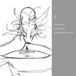
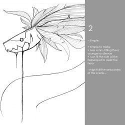
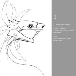
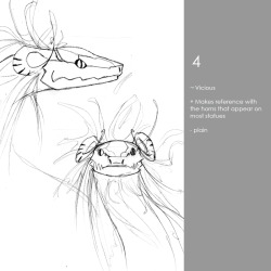
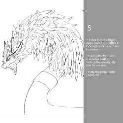
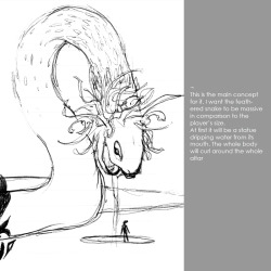
After a long time of thinking what would fit better for my environment and making sketch after sketch about some of the more important aspects (aka the snake) I decided to go for the public opinion to help me decide on which concept to go for. I posted some polls on facebook and tumblr just to get a general idea of which design is more "liked". 
At the end most people liked number 4, but more than heading me towards choosing one, I got some really good feedback. 
I manage to start modelling it from scratch and tried starting with different primitives (cylinders and cubes mainly) and ended up working with only half of a cylinder and mirroring it at the end. I'm still going to work on it. Add some more details and the feathers, but mainly I wanted to get this as a "low poly" model and work on zbrush (for some reason just can't install mudbox) and work on a high poly model to get some normal and detail maps for the low poly model. 
Doing the UV map for it was quite complicated specially for the head part, but I think that I manage to get something decent at the end. It is quite complicated to model organic stuff, but hopefully I get better at this soon. 

27.3.12

Media specificity...

Medium = material or technic means of artistic expression.
Media = plural of medium.

The communication media is the product of our sad inability to communicate directly from mind to mind (sad indeed).
On the Phaedrus Socrates said that 'the alphabet created forgetfulness', and in some aspects it does make sense since now a days we use technology as an extension of our memory.
Humans have developed tools to use as extensions of our existing faculties and it has expanded in every single direction. In retrospective we could say that animation started because of the need of filling and artistic part that film couldn't do at the moment in time, just like film started by the urge of photographers of taking still images to the next level. The whole idea of innovation it's only a way of humanity to keep exploring and evolving and exploring new boundaries of different fields.
'Animation is not the art of drawings that move, but rather the art ofmovements that are drawn', noting 'what happens between each frame is more important than what happens on each frame'                                                                  Solomon 1987
Because of this happening at an alarming speed, we can say that now a days it's really easy to find same products or brands that are using as many media as possible to expand their creative range and at the same time to get as much public as possible.
Medium specificity is the view that the media evaluates a work o f art, design, etc using the media in the best way possible and in order for a medium to have characteristic qualities it must be grounded in a tradition that has established these qualities as intrinsic properties.
"An artwork, in order to be successful, needs to adhere to the specific stylistic properties of its own medium"                           Gotthold Ephraim Lessing 1776


World of Pokemon


This is my practical response to our transmedia project. I decided to go for Pokemon as my example since it's one of the biggest video games franchise (and because I still play the games).
For those who haven't play the game boy games, I suggest you do since I based this project on the intro of the original games.
Sorry about the million of spinning images, but I found myself in the middle of the project whit an overload of stuff to put on and not enough time.

20.3.12

A History of Type

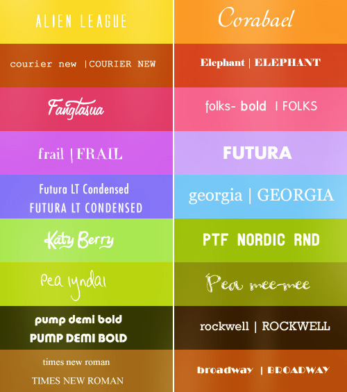
Having a little bit of a graphic design background I found the lecture on typography very interesting (11th of January).
Quite enjoyed the history bit behind it since it now brings a good reference to the different types of classifications:

- Humanist: imitating human handwritten and easy to read.
- Old style: rationalisation of the fonts.
- Transitional: scientific and mathematical order of the font (18th century)
- Modern: high contrast and ordered.
- Slab-serif (Egyptian): gets attention.
- Sans serif: simple and just to communicate.


Typography in animation and games is usually used to give an introduction or a 'feeling' of what the actual piece is going to be about. The using of title sequences is become an incredible useful part of any type of animation, and even now some games are using it as a type of trailer.

Some good example I've seen for 2D animation are openings for japanese animations (anime) and some of the biggest studios in that industry actually put good effort on them, since you get to see them on the beginning of every episode, having sometimes as a result, an opening with much better quality than the rest of the series.

Tank is the theme song for the opening credits of Cowboy Bebop composed by Yoko Kono. It has a mix of jazz and electric music and the text that appears moves and jumps according to the bases, and it also carries with the execution of the rest of the visuals.
Uses a basic palet of colours and it gives you a good introduction of the main characters focusing on the good design of the silhouettes.


Coraline is another good example of a good opening title sequence, because it not only gives you an idea with the font that it is a creepy type of story, but it actually set up some premises that are art of the story later on.
As a stop motion animation based on craft doll making, bottoms and thread are part of the titles and typography.


“Be careful what you wish for.”
With a descending doll all expectation is set aside at the start of author Neil Gaiman and director Henry Selick’s Coraline. Her punch-and-cut deconstruction is distressing; at her inversion you may feel a gastric tug. You may also dream of submissive needlepoint only to awake with new eyes.
To paraphrase the film’s series of alphabet posters, “‘C’ is for Coraline – brave little girl. Who unlocks the door to a whole different world.”


14.3.12

An evaluation?

         Evaluation: ends in what to do to improve. Assessing the strengths and weakness of programs, products or people to improve the performance. 
An evaluation will always involves asking questions and answering not just in a way to sound clever, but instead to make an analysis, reflect the capacity and judging the evidence.
The purposes of this comparison making, landmark talking and measures is whit the whole purpose to make a change, to do something, to act.

Keeping in mind this points will certainly help myself to constantly improve my projects, but I just hope that while measuring my abilities with profesionals I dont get stuck in the comparison that could bring my hopes down. Also this is constructive way to give and revive feedback.

Longway North


Sasha, a young Russian aristocratic girl at the end of the 19th century, dreams of the Great North and languishes over Oloukine, her grandfather, a renowned scientist and Arctic explorer, who has not returned  from his last expedition to conquer the North Pole.
He transmitted his vocation to Sasha which is far from satisfying her parents as they have already arranged for their daughter to marry.
She revolts against this destiny, glees and is resolved to going to join Oloukine a long way north. 
Video made by Sacrebleu Productions, a studio that started on 1999 in Paris, France.
My knowledge of french is almost none, so it's hard for me to understand their website, but something I did understand is that this animated film was presented to the Cartoon Movie festival in Lyon 7- 9 of march 2012.

13.3.12

Jabberwocky - Game Cinematic


This was a game cinematic for the game Jabberwocky by Blur Studio. I found it by coincidence when I was looking for the famous Lewis Carroll's poem that appeared on trhough the Looking-Glass, and what Alice found there  (turns out the game was relate to it).

The animation seems stylised in a cartoonish way, and the colours are my main inspiration for my game scene.
I tend to find non realistic, but well made styles like this one really attractive since it gives you the freedom to be more creative in a fantasy world.

The design was made by Todd Harris and the animation supervisor, layout artist and animator for some scenes, Leo Santos. Unfortunately his is an unreleased game, which is a shame because I could see a lot of potential with this quality of work.

12.3.12

L'Odyssée de Cartier


L'Odyssée de Cartier is the new Cartier film (advert ) which takes you to a journey between dreams and reality. This is the very first time that Cartier has decided to create a cinema epic focusing on its history, its values and inspiration, its artistic and universal scope.

It was directed by Bruno Aveillan, and certainly it's a fascinating piece of film.  It effectively transmits the elegance and design that the company always focus on.

8.3.12

Kara


I found this video of a concept that Quantic Dream Studio (creators of Heavy Rain)  made just to test the idea, but it's not currently a developing project.
It's really sad, because the mechanics that they used where made on a really good quality basis for any PS3 game. The graphics and sound are stonishin astonishing, but it's the plot that really captivate me. In such a short clip you get a really good gesture of the hard work on emotion that this studio has, just like I appreciate in the few hours that I played from Heavy Rain.

6.3.12

Do I have power


Found this stunnin music video made for the Timber Timber song 'Do I Have Power' that was created by Carlos de Carvalho.
I wish I had found it when I was working on the 2d animation 'Isolation', but now that I'm doing some 3d this kind of work gives me ideas for other kind of twist I can give to CG styles. This also reminds me of the importance of keeping a constant art style and the possibilities that can occur when you explore and mix some tools and medias.

Check Carlos' website to see more of his work.

Wicked Animatic


This is an animatic I found from Heidi Jo Gilbert, a CalArts artist. In it is a possible representation if the play Wicked was transformed into an animation. The concept is awesome and obviously the songs are fantastic.
I found it interesting because it gave me a good idea of what actual professionals take as storyboarding and animatics and it helps me to race my standards on my own work.
(I did not download this song for my ipod after this... ) 

Some ideas

At the moment I've done some ideas for the scene of my game. continuing with the Mayan idea, I came up with this concepts:
At first, you arrive to an altar with a massive feathered serpent that's dripping water from its mouth. Around it, there will be walls fallen pillars with inscriptions and decorations.

Once you step into the main part of the altar, a secret realm will activate and everything will change. The idea is somehow similar to Zelda's twilight realm or silent realm, where everything is basically the same but the textures will be changed and the snake will be alive. 


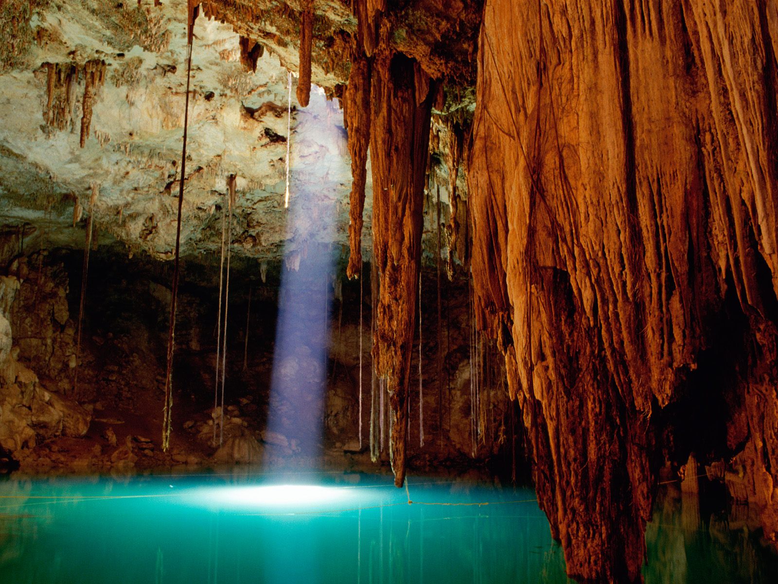
It took me a while to decide to make it indoors or outdoors, but at the end I came up with the idea of placing the altar into a secret location, somewhere that makes a special conecction between the character that is the only one to find it and the spirit of the serpent-god. So everything will be based in a Cenote (like an underground lake) where the character is going to fall into.

I'm still working in more ideas, specially cus I'm planning to spend most of my polygon count on modeling a decent snake, so if anyone has any ideas for a cool snake-god-type then I would appreciate it. 


4.3.12

José Alves de Silva

Jose Alves da Silva is a Portuguese 3d artist that has had loads of appearences in magazines like 3dtotal and 3dcreative.
Appart form loving his over stylised way of working, I found very interesting to find a some images of the same final product, but in the different phases of it's making. Like the one below, you can see the turn around of the character on actual clay, a final 3d model and the final product with textures and post production. Also de fact that he started his current 3d passion by doing a degree of architecture kind of game me a little bit of hope of being someone in the industry.
Check out his website and portafolio:

http://www.artofjose.com/
http://josealvessilva.daportfolio.com


28.2.12

Book cover

Once again, non relevant to anything, but it's part of my practice so I'll just post it. 
As some people know I've done a book cover in the past and the same writer asked me to do another one for his newest project. Awesome! 
So the most important thing I get from this is practice and stuff for my portfolio (also my name is in the book which makes me feel happy).
Anyhow this is the final outcome of the picture:
(apologies for the massive watermark, but it will get published, so I don't wanna get into trouble)


Right! now time to focus on the essay ... fun! 

27.2.12

Quetzalcoatl

Right so after a massive mental/art block, I manage to settle down my ideas into something more concrete.
Since it's 2012 and the mayans say that we're all going to die, why not basing my game scenario on it! (oh yea...also cus I'm mexican...arriba! )
So from all the legends I know from ancient Hispanic cultures Quetzalcoatl is my favourite one and it's also because a serpent with feathers is cool.
I've been looking at the patterns and details from several ruins and I'll try to reflect some of the aspects from this amazing culture.
Here are the mood boards with pictures that inspired me:


Any how, I'm not going to make a historical recreation, instead I'll adapt some of this concepts to a fairytale-like environment. It's a really huge concept and there are loads of details and ideas I would have to work on, I just hope it's not too ambitious.

26.2.12

Xilia World

Tales of Xilia for PS3 is a game about to come out in Japan from Namco studio.
I've been crossing fingers for it to someday come out in Europe, but meanwhile I've been following some updates and trailers.

Asides of me being a stupid fan of the series, This time is the environment that caught my attention since I liked the feeling they put to the scenarios below.
The concept of the harmony between water, trees and a city landscape is really attracting. Also the play with light and dark in this case seems to be a concept that needs to be carefully played, but the dark silhouettes that you get give you an amazing feeling of magic and mystery.  


25.2.12

Less is more

While thinking of ideas for the scenario many ideas pop in my head, yet none of them are concrete or maybe it's just me that can define what concept I want to go for. Some of them are way too ambitious, or at least for this since the focusing point is quality over quantity , yet some other go to an easier target which I have tried before in the past.
As most of the times I like to try something new, get myself out of my comfort zone and challenge myself with something near the edge of idiotic, and this project won't be the exception.

I've been looking at all kind of inspiration over this past weekend, some of which I plan to post later, but none of them have gave me that flash of inspiration that I'm looking for. Most of he times I tent to over thing my ideas, multiple times causing a frustrating outcome of my work and covering part of my possible potential for some pieces of work.
I started realising that whenever I force myself to come up with an idea I end up blocking myself of the basic aspects and over saturating with unnecessary details.

Thankfully I happen to finally get to see the film 'In time', which was recommended by one of my classmates during a PPP presentation. I started thinking of the core idea for the film and not taking in count the multiple flaws of the film, the plot itself is absolutely fantastic.
Recurring to simple and essential ideas that we usually don't consider due to its own common nature can sometimes bring up some of the best and well established ideas; in the film's case, time.

If something my years on architecture thought me is that most of the times "less is more" and I'm intending to apply this to my concept.