31.1.12

Draw with me


This is one of my all time animations I've seen on DeviantArt.
It was made by Mikeinel, a digital artist from the Philippines, and a collaboration for the music with Daniel James (HybridTwo).
Mikeinel describes the video as as a story about a girl and a boy separated by an unbreakable glass, which sounds like a very simple concept, but the way he face this 'love' story was completely out of my expectations and I just cant get over the plot twist that exist in last few seconds of the animation.

Beautiful colour concept. Sort of surreal and artistic that fits the whole concept of a desert world where only the two of them exist.
The plot twist was a bit inspiration for the ending of 'Isolation'. A more psychopathic ending that enhances the desire/feeling of loneliness on your own mind.

Second Wind


One of my favorite videos on Vimeo is this short animation called 'Second Wind' as part of a project of Ian Worrel. It was a project on his final year at CalArts and the tools that he used where pencil and paper for the man and the cat line animation. It was coloured in photoshop, composited in after effects onto backgrounds constructed in photoshop out of various pieces of media (pen/ink, pencil, paint, photos).

Pretty impressive animation with a touching narrative that brings good memories of when most animations where hand drawn. Enjoy!


When working on the final editing for 'Isolation' I realised that there's loads of things we should have worked on. 
Things I notice is that probably the combination of having the backgrounds on a more artistic-looking with the simple front might be too contrasting. Probably playing more with textures would have been helpful.
Next project, I'll make sure to give the editing more time and dedication.

30.1.12

Isolation II

My responsibility for the animation this time was the scenario which is basically just the 'island' where the person is.
I thought it was an easy task to just do a few frames of the tree and some others for the grass, but my original plan was to do it in photoshop which didn't turn out as I expected:


The only type of animation I've done in the past were small gifts that didn't required much fluid movement, but I wanted to do it properly so I decided to drop it and give After Effects a try.
Thanks to some tutorials online and to the file that I had on photoshop already made it was just a matter of parenting and rotating to give it a great fluent move; and I say great because I almost cry when I saw how pretty it looked... Or probably it was just my excitement for seeing it moving.
Either way, after some tests, it was quite hard to get a realistic movement and because of the lack of time I had to leave it looking like a jellyfish:


For the grass it was the same process: drawing a few separate parts and parent them so that the rotation affects the children. It was easy up until the point where I had to duplicate for a ridiculous amount of copies, positioning them in front and behind the tree to give a more "3 dimensional" feeling and having to give them different timing to make it look more of natural random movement.

I'm quite happy with the outcome. I know there is lot of room for improvement, but we're running out of time. I'm pretty sure that the awesome animations that Ryan is doing for the character plus the beautiful backgrounds from Sophie will help a lot to distract people from noticing my mistakes (lol).
I hope the post production and editing doesn't end up being too complicated since Daryl and Tom are busy polishing the first poem.

Clouds

This was one of my inspirations that I found on the web. It was a final second year project of Sam Miller, a student of animation from the University of Hertfordshire in 2008.
I think the animation is beautiful and it has a really artistic touch on it. The fact that most of the backgrounds aren't as detailed as the main character gives the idea of it being a paint.
The concept is simple, but really original.
It really impressive how a small group of people can manage to make such an amazing project.
Also, not only is well animated, but I think it has really well planned shots and a positive editing.


The sound goes along very well and the voice of the mother at the end it's just awesome.
This kind of animation may look simple, but I'm pretty sure now that it takes a LOT of effort to achieve something like this.
I really hope I manage to improve the quality of my work on the coming years.

Also, check out Sam's website! It's got really nice illustrations :)

Inspiration for 'Isolation'

Some of the inspiration that came to my mind when thinking of a concept for the animation was a to make it simple and monochromatic like the bit of the shadows on the corpse bride song (remains of the day, starts at 0:45... good song though).


Then also remembered the video that appear on the Harry potter and the deadly hollows called The Tale of the Three Brothers.
Even thought that one was made on 3D , the concept of having very strong profiles without colours or detailed expressions push the animator to use techniques more theatrical since all the emotions have to be expressed with the bodies of the characters.

Finally, and because of our lack of experience, I moved to something more easy to animate, but keeping the simplicity concept. That's when Gary mentioned the open sequence of 300 and if resembled of something more closer to what I thought we could achieve.


Again, my experience on animation on After Effects is almost nothing, but thanks to some tutorials online, help from friends and loads of trial-and-error practice I think I got the hang of at least basic stuff and getting really familiar with the interface. 

21.1.12

Isolation - I

Finally talking something about the second poem we're doing, I'm glad to say that we decided to make an animation! (nothing to do with the fact that I kept insisting over and over) 


Now, it was great the fact that we decided to go for that, but being realistic... we have no time for it! so despite the fact that we probably went too ambitious with it, we decided to carry on with it but at the same time to keep it as simple as possible.
The poem itself helps:

Isolated like the emotions I have held for many years.
The cold weighs hard on my bones.
As the dark clouds begin to gather,
quiet surrounds the air.
The rural space echoes with stillness.
The picturesque image engraved in my mind.
Like a single tree embedded in a field,
The wavy grass hangs around to help ease the loneliness it feels.
The sheep wander aimlessly in this desolate sphere. 
Zenam Bi 

Getting on with this subject of loneliness we also integrated the part of simplicity. 
This are some of the ideas I came up with as 'concept art' : 


After some discussions and brainstorming we came to this storyboard:


My job in here is to do the scenario. Even thought I haven't try much on animation other than simple gifts, I'll give it a try, and specially because Ryan is in charge of doing the character and he is AWESOME! so I'm sure it will look great at the end :) 

Key image for the front scenario. Something I did quickly to give us a point of start. 

Next I'll put the animatic and some of the sound test my friend Adam has made for us.

Dust

Found this video online a while ago. The animation is extremely cute (BEWARE!) and well made. The texture it has resembles a watercolour technique very well achieved, but what catches my attention the most in this case is the narrative part which in some way relates to the animation we're making for the second poem.
I now notice the importance of the music and sound effects for a film/animation and even more for those without dialogue.
Anyway, I leave you this peace of beauty <3

Poussiere-Vic Chhun, Leyla Kaddoura, and Nicolas Ughen

Weightless

Dance + Architecture + Awesome concept = THIS VIDEO!


This video that a friend of mine whose studying at the Northern School of Contemporary Dance showed me was simply beautiful.
Love the way they  played with the scenario and the whole concept. My favourite part of the scenario is the  'water on the wall'. Couldn't think of a better way to express the concept than 'moving the whole world' just to defy gravity.
Very well planned scenario. Simple yet beautiful.
Sure it helps to think outside the box and imagine different ways to come with a solution.
Also, it really enhanced my desire to get involve in more interdisciplinary project. Sure I'll ask my friend for a collaboration soon :)
Anyone interested?

[Let your values guide you]


On January the 10th we had the a special guest called Andy Peers. He went on about part of his life and experiences that got him to where he is now (Love enterprise). More than talking about how to be successful, he mention the importance of your own values and how by sticking to them you create your own and personal success. Having said that, I started wondering about my values (since it was one of the questions that came on the exercise sheet). I believe that my values have always been really strong thanks to my family having loyalty, honesty and responsibility in hard work as the strongest ones. I've always had them in mind, but then I started wondering: 'what about the ones I lack the most?' After some moments of self reflection I started to realize that I often forget to analyse my own limitations, and I suppose it is still a sign of what's left of my young and naive side. Is not that I'm getting old, but certainly not getting any younger (lol) and this kind of reflections help me recognise myself as an individual. Being away from my family and most of my friends has help me to encourage my dedication and commitment to the games and animation world.
"It's not hard to make decisions when you know what your values are."       Roy Disney
Another of the questions on the exercise sheet was something like Why are you studying this course? (or something like that)  
Loads of things crossed my mind at that moment. My answer was 'Because I believe that I can create life that will inspire someone...one day' ...pretty lame, but I was thinking of the people that inspired me to decide to take this course, to drop my whole past and embark on this new adventure.

I found this on tumblr and decided to put it here. I know that posting about Pixar must be cliché by now, but I do believe that they all share really strong values that it's reflected on their work.


Creative - Courageous - Valuing Difference - Inspiring - Honest - Thoughtful

"Let your values guide you"  is a phrase that I'll try to make mine, hopping it will help me to be less scare about the future and focus more now on growing my talents and improve as a person. 

"You've got to find what you love. The only way to do great work is to love what you do. If you haven't found it yet, keep looking and don't settle"  Steve Jobs

15.1.12

Design in Animation

Here are the 20 tips for the design of character for an animation:

  • Research & evaluate
  • Design & plan
  • Target the audience (who is it aimed at?)
  • Visual impact (what gets people's attention?)
  • Line qualities & styles
  • Exaggerated characteristics
  • Colour to communicate character's personality
  • Adding accessories
  • Thinking in three dimensions (all angles) 
  • Conveying personality
  • Expressions (character's range of emotions
  • Reasons (goals & dreams to achieve)
  • Building back stories
  • Quick on the draw
  • Hone, plan & polish
  • A character that works on any media or material
  • Real world drawing (drawing outside computers) 
  • Release the beast (show and ask for feedback)
  • Beyond the character (environment) 
  • Tuning the figure (question each element) 

3D Matryoshka

For my project of 'Fundamentals of 3D modelling and animation' module I decided to keep it simple and go for a Russian Doll (Matryoshka).
I've always like this dolls and it perfectly fits the idea for the project 'Large and small'.
The concept of its movement seems limited by not having any arms or legs, but that's where I plan to practice and apply the principles of animation. Also I plan to animate their faces to enhance the movement and give more narrative to my animation.
This are some of the pictures I used as reference for my modelling:
 

And obviously the modelling didn't took long:

Also...I know this isn't 3d (more like stop motion)...but I will use it as a reference for some movements. (Although, this dolls have arms )


Outline your implications - II

Because the video had no lines at all we thought the music composition should be something important to consider and luckily a friend of mine, Dr. Adam Fergler, agreed to help us with it.
The video below is a quick animatic that I made for him estimating the timing for most of the shots that would give him a good start for the melody creation.


This is just a short preview of what the final melody will be like. Basically he's waiting for the real footage to be done and once we get closer to the final product after some editing he'll be able to finish some details to fit the video correctly. 

So far Adam is also going to work on the melody for our second poem. Can't thank him enough.
Visit his website!!! : http://adamfergler.eu/

13.1.12

Outline your implications - I

Right as part of our task on the Digital Film Production module, we're meant to be working on videos that respond to some poems. The first one is called 'Outline your implications' written by Razia Afzal. Basically the video is about a love story between a guy and a girl who belongs to a different religion, and is this religion that is going to keep this two separated since she has to respond to her 'duties'. From the many interpretations that we could make from it, the one that we all agreed was that this girls belongs to a religion similar to Muslim where women have to have a partner from their same religion.

Even though it was hard to define jobs in the group, I've been working in stuff like Concept art, 'script' [the video has no lines, but we've been writing the process of the scenes] and also part of production [just helping with some of the organization].

This is part of the concept ideas that I came up for it:

This one was the original one of the first ideas:


 This one is the final storyboard:


Lake Hurwitz

Lake Hurwitz is an absolute fantastic digital concept artist that lives in San Francisco. His work focuses on a realistic imitation of traditional painting, and the real part that attracts me from his work is the way he captures expressions, moods and colour in a way that he considers 'speed painting'. Now I've seen a lot of speed painting artist, but no one as accurate as him. Anyway, here's some of his work and a link to his CGhub account to see the rest of his art:


9.1.12

- practice -

Now I know this might be irrelevant to the course, but it's most of the practice I did on during this holidays.
Instead of doing some proper post or thinking of something that will actually help me to get a good grade (any grade at all ...) I've been working on a book cover.
Now I've done this in the past and the only reason why I'm doing it again is because I quite like the experience and practice that you get out of it (plus is nice to put something in your CV that is actually true).
Rather than the pay and the fame that I might or might not make out of this, I decided to keep working with this author because now we became friends and I feel like I own him for giving me the chance in the first place.

Anyway. The book is now very (VERY) dramatic, since it tells the true story of the author when he went through really hard times while having a kidney disease, so in comparison to the last book, which was a teenage  novel, this one required a lot more of seriousness. His idea was to go for something more realistic, but being honest with him... I'm terrible at drawing realism, or at least is not something I'm familiar with specially when it comes to creating something out of nowhere. (with realism I feel more comfortable if I have a model to copy, but I wont bother for that).

The author was fine to do it in the way I felt it was right, and for some reason he keeps thinking that I'm a professional and that I got everything under control... so I keep making him to believe that.


This is a screenshot of the progress so far. I did loads and loads of sketches and none of them reflected that semi realistic and relief feeling I was looking for, but as one of my friends pointed out, my best option was to  keep his eyes close. That did helped me to keep it slightly more realistic. 

Anyway, I still like to play with colours even though it completely kills the realism and also working with loads of different brushes makes the skin look sketchy, but truth is I'm still working on it so any suggestions and critics would be really appreciated. 

17.12.11

Christmas...

While looking for inspiration to do some work I came across this video. Just thought I'd share it for those in the course who like traditional animation and drawing is part of their daily basis... Merry Christmas :)


14.12.11

Italian Vernacular Cinema

film is not the art of scholars, but for illiterates 

Around 1970´s, working class italian used to go to the cinema every night as part of their daily life. Being transform into a habit, it became more of a social space where the convention of watching a film was different and talking, drinking and smoking during the show was common. It was divided according to classes; Prima and seconda visione was always in mayor cities and the audience selected the film to watch, while the terza visione was more of an industrial and rural area and the audience had limited choices and would watch the same films for a while.


This is the time where auteurs like Federico Fellini started introducing his films full of style and sophistication such as La Dolce Vita (1960) and 8 ½  (1963).

Other auteurs from the time that shared their own points of view about modernity, set pieces and eye line shot where pioneers to the new genre called Giallo, a mystery/horror that had place between 1970 and 1975 with films like The bird with the crystal plumage by Dario Argento (1970), The girl who knew too much by Mario Brava (1963) and Death walks on high heels by Luciano Ercoli (1971).

Speaking of the essence of this films and what the auteurs where trying to express, some of the contemporary films that we can find with similar aspects could be Black Swan (2010), Death Proof (2007), Dressed to kill (1980) and Black Christmas (1974)


8.12.11

CG Reality

Knowing that my interests go more towards cartoonish-animation and videogames, I've always found very impressive the quality achieved in some films that incorporate in a realistic way parts of CG.

On my years doing architecture and trying to achieved a realistic-looking renders was really complicated (specially when you have short deadlines). There are so many aspects that you have to match with reality that you normally dont notice. Lights and shadows reactions are the hardest ones. Textures and camera angles.

The short film underneath are just some shots from Paris, but the impressive work that has been done to make it look like floated is amazing. The water looks really realistic and the reflections on it gives the complete feeling of it. I assume the illumination was made with images from the same place. (Worth watching in HD) 


5:46 AM // Paris Under Water


Mimicking fluids, specially water, has always been complicated for me since my computer dyes every time I try.
Also not only in the field of fluid, but the integration animating surroundings to make something surreal yet realistic looking. The adverb below is a good example of it, because of the synchronization with the music and the dance with the animation makes it really good looking.


While trying to work in the past with 3D max I remember being a huge fan of Josep Kosinski, because of his architectural background I was years ago, so probably the graphics now are not that impressive, but the point in the composition is there.
Here's the adv called Race from Mezzo. The first one is the complete advert and the second one is the steps for the composition on the visual effects.
It gives you a good idea of how professionals work and the most important steps to considering when making a composition with something that has already been filmed with real actors. 


Can't wait to be able to play with light in maya. I always struggled a little bit in 3D max and if it wasnt for render engines like Vray I wouldn't have been able to do anything in decent quality. Hope maya is slightly easier  (屮゚Д゚)å±®

30.11.11

The 'Auteur'

With an origin in the 1920's, but flourishing 1960 - 65 in where film directors started adding an individual style and taking complete control over all elements of their film production.
Having this creative control added a unique stamp and made this period in time an iconic season for the film industry.
Authors like Hitchcock manage to control the audience emotions (either european and american) by creating a surrealism, suspense and expressionism defined his style and made films like Psyco (1960), Vertigo (1958) and The Lodger (1927).

Now a days I find the director and producer Guillermo del Toro an inspiring and with some similar aspects that make films in which he has been involve iconic to mainstream audience; and also the fact that he's a world wide renowned director that comes from my city (Guadalajara, Mexico) makes it even more appealing to me. He worked on the Hellboy saga, Pan's Labyrinth and the coming The Hobbit, nothing more iconic than that (there is...but can't think of another mexican one) 


29.11.11

+ Legacy in the sky +

Having the releases of games as renamed as skyrim or assassin's creed: Revelations makes other games not to look as attractive, specially when they lack of publicity.
I got really excited to get my special edition of The legend of Zelda: Skyward Sword specially for being a big fan of the series.

After playing it for several hours you realised how impressive this game is.  Knowing the graphic limitations of the Wii platform, the nintendo crew in charge of the develop clearly aimed to something not too ambitious for the system making a merge graphic style between the cartoonish wind waker and and the obscure twilight princess. The whole game and the cinematics creates a really colourful story telling experience that doesn't even include voice dialogs.

The gameplay is increased thanks to the motion control and now the enemies react to your decisions, making them more complicated and taking it off the just pressing A button battle system.

The maps are constantly challenging being transforming it into a really refresh approach to the series.
Knowing that not only is me (and Sarah) who think is an awesome game, but also it was qualified by IGN as 10/10 Masterpiece makes it even a better game.

Graphics don't make a game, so this is an invitation to all the sceptical to try the game and erase the idea of nintendo being repetitive and childish.


27.11.11

Stop Action

Stop motion is one of the topics that has always been attractive to me, although I've always been really scared to try it because of the amount of dedication it requires to make decent pieces of animation.
Films like Nightmare before Christmas and the Corpse Bride from Tim Burton or Coraline by Henry Selick are some of the proves that animations out of the range of 2D and 3D animation are just as strong and beautiful.

A quick gif showing the process in animating Coraline.

The kind of skills the artist have to have for this animations is what makes it more appealing, since computers is in most cases are only used for editing, but the rest of the works has to be handmade. 
The videos below show some adverbs directed by Jamie Caliri and the artist behind it made every single part in paper: 


It is a beautiful way to appreciate the traditional art that teams like this ones produce, because it's impressive how  they don't seem limited by the lack of infinite canvas and the idea of not being able to correct mistakes as easy as a digital artist can.

I'd like to try this sort of animation one day, but I assume that finding an appropriate team to work with most be the most difficult part since there doesn't seem to be many groups that focus on this way of animation.

22.11.11

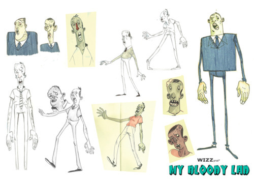
Zombie lad

I found this animation on my Tumblr dashboard and thought I might share it here.
I like the concept and the whole idea seems original.
The expressions of the characters are very well achieved and it reminded me of my old times watching shows like Ren & Stimpy where the characters contained expressions more grotesque and obscure that probably puts the animation/cartoon outside the range of kids allowed programs.
I'd like to have a zombie myself ♥


This is the concept art for the zombie :)

15.11.11

Street Art ~ Graffiti!


graffiti: : usu. unauthorized writing or drawing on a public surface

That's the definition of the Merriam-Webster dictionary, and several other dictionaries refer to the definition with synonyms of vandalism. 
Even though it could be considered to have its origin on cave's walls from the Paleolithic like the oldest one discovered in 1940 at Lascaux in France where there where starches made with animal bones and other natural paints. After that there are some other forms in Ancient Rome (Pompeii) and could be because of that the word itself comes from the word graffiato ("scratched") in italian.
Obviously the biggest wave of graffiti expresion started in the 1970's in New York having as a main feature the spay can graffiti that evolved along side the hip hop culture.

It was a way of announcing a presence, either a group or personal, but it was always a way to say 'we will not be ignored'. This was ended up making the language of the streets visible to other social groups.
From what I can relate to graffiti involved into my field, the first thing that comes to my mind is the video game Jet Set Radio for Dream Cast published by Sega, which is a game that describes the basics of life in Tokyo for a "rudie", a term used to refer to young people who roam the streets spraying and skating, as a means of self expression. The game was fantastic, but now that I think back, you where always being chased by a police officer and some other gangs... but the game play and the massive scenarios where fantastic! Also it had a unique artwork and an catchy soundtrack.


Also, there is this film-documentary called 'Exit Through the Gift Shop', filmed by the frenchman Thierry Guetta and featuring artist like Banksy, Shephard Fairey, Invader and many other of the world's most infamous graffiti artists at work. In here you can see the way that many contemporary street artist work, but most important, what they think and the reasons that pushes them to do what they do.


Despite the style and manifestation of graffiti, there are many artist that manage to express the main message through their work, but there's always the counter part of vandalism. It might be worth less making a piece of art while invading some else's property.

There are plenty ways in which now a days graffiti artists manage to express themselves without having to damage or concur to illegal procedures, like one of my favourite artist David Walker, who 'paints' on abandon vans and always creates beautiful pieces like the one underneath: 

Postmodernism ...

12th Oct 2011

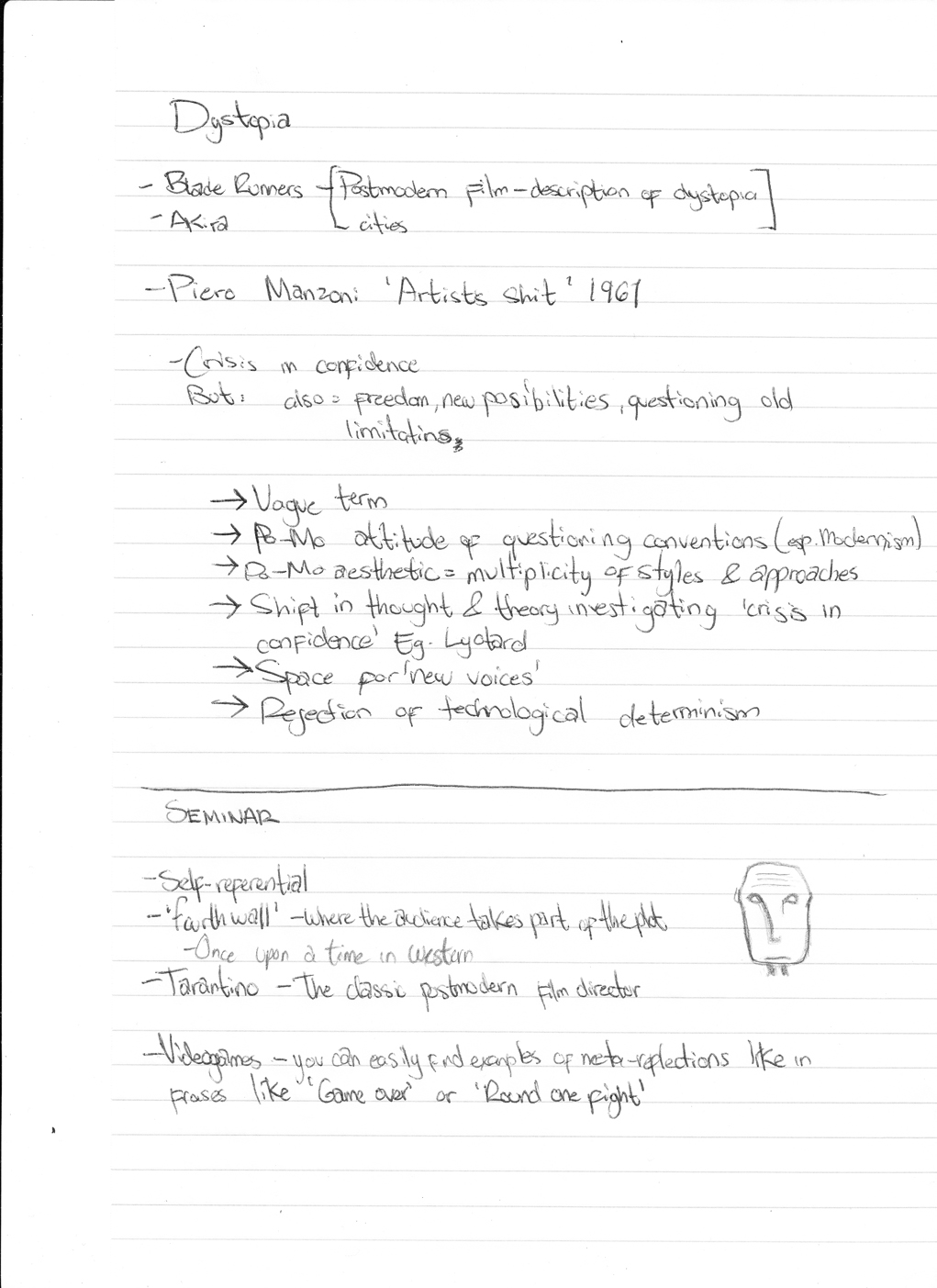
It was a long time ago, but on that lecture/seminar we discussed about Postmodernism.
As a contrast of what modernism represents, the exhaustion, feeling of pluralism, the pessimism in society and the disillusionment with the idea of absolute knowledge were the main subjects in a postmodern mind.


Having its origin in the early 1917 with the german writer Rudolph Pannwitz when he made a reference of the "an-normal, post modern man".
From there, the term of 'postmodern' was used to represent the after modernity, contra modernism, 'late capitalism', artistic and stylistic eclecticism or the 'global village' idea of Globalisation.

After the end of Modernism (15 of July at 3:32pm, to be more precise, when the Demolition of the Pruitt-Igoe project took place - according to Charles Jencks), people started to develop an attitude as a reaction to modernism rules, and basically ended up having the no rules as the only rule (paradoxical...)
At some point it was celebrating what might otherwise be termed as Kitch and it also became against totalising the belief systems (metanarratives) such as religion as people developed a condition of incredulity.

Image of the fifth element showing the 'speed' of society and the unadaptable character to the environment.

As for art, the aesthetics became chaotic, and the complexity increased along with the mixing of materials and styles. Pin-up style and the re-using images as part of a parody became a common way of artistic expression.
This relationship between the city landscape and the artist was reflected in a crisis in confidence but that at the same time started to evoke ideas of freedom, of new possibilities and more important, to question old limitations.


Even though it's is a very vague term, it's clear that it caused a multiplicity of styles and approaches that still have effect in the aesthetics from now a days. Examples of it can be found in some animations like Akira by Katsuhiro Otomo (1988) or the film 'the 5th element' by Luc Besson (1997) where even when they express futuristic ideas, they keep having that idea of a Dystopian society where the image of police states or cities where technology has progressed far more rapidly than humanity's spiritual evolution and the government (or control source) has unlimited power over the citizens.

Notes!:


1.11.11

“Corporate Cannibal" - a frightening pulse


"... I'm a man-eating machine
you won't hear me laughing, as I terminate your day
you can't trace my footsteps, as I walk the other way..."
Those are parts of the lyrics coming out of a stretching, sinister silhouette that kept shifting from on an empty background.

As I was looking at the video from Grace Jones called "Corporate Cannibal" on the first seminar we had of Context of Practice all that came across my mind was "disturbing". That must have been because I had no clue what to expect and didn't had any knowledge of what context or purpose that video was made.

After analysing and watching it several times, it was still a bit disturbing, but paying attention to the lyrics you realize that this music video was not only made with the purpose to promote an artist; but it was a way to express a feeling, of at that time was starting to experience the feeling of globalization. It seems like a simple video at first sight; a white background and a woman being deformed by a computer effect, but once you analyise it, all those aspects seem to go a bit further and things start to make sense.

The woman is a human representation of 'technology' it self. As technology is based on an electric and algorithmic plane, the background takes a place an blank or empty space, yet infinite, where the contrast with the woman being black (and not as in a racial aspect) gives a bigger impact to the image creating a minimalist effect.
" my rules, you fools"
By doing the distortion of her body the whole body and most of the time in a vertical way, it gives an effect of constant movement and instability which is a particular characteristic of electricity; as if she was a modulating signal.

At some point, getting lost in the lyrics, it made you feel like you have no scape to the 'prophecy' she's singing; a no way back no matter what.

The sinister way of singing and the multiple expressions she performs during the video are apparently part of the tendency Grace Jones has; although most of the times she sings in some kind of feminist wave. This time she has mixed an aggressive style of fashion and a genuine concern among many contemporary sociologists and that is the near future effect of globalization in a network society.

This could be a perfect example of how there's no need to represent a song's lyrics in a literal and cinematic way, and instead making it a call for the mass to realize how corporations have no limit in their greediness.

"... I'll consume my consumers, with no sense of humour
I'll give you a uniform, chloroform
sanatize, homogenize, vaporize...you..."

31.10.11

Reban - Final

I just wanted to show some final images for my character development.
The first one is the final part of the animation. The point where Reban brakes the big stained glass and escapes from the laboratory.
I wanted to give an impression of movement with the crystals in the first plane.
Didn't like the way the broken stained glass looks and also it needs some blood (lol). I wanted to show a different type of crystals in this picture.

This one is just a dynamic pose trying to express more the colour I want for Reban.
This last one, I did it just for pure anger of leaving my USB and not being able to work on the environment's colour, but at the end was the picture that I liked the more. It's a scene of Reban in the test tube, connected to several machines to study him.
I