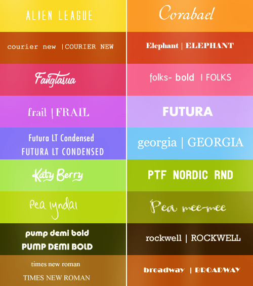
Quite enjoyed the history bit behind it since it now brings a good reference to the different types of classifications:
- Humanist: imitating human handwritten and easy to read.
- Old style: rationalisation of the fonts.
- Transitional: scientific and mathematical order of the font (18th century)
- Modern: high contrast and ordered.
- Slab-serif (Egyptian): gets attention.
- Sans serif: simple and just to communicate.
Typography in animation and games is usually used to give an introduction or a 'feeling' of what the actual piece is going to be about. The using of title sequences is become an incredible useful part of any type of animation, and even now some games are using it as a type of trailer.
Some good example I've seen for 2D animation are openings for japanese animations (anime) and some of the biggest studios in that industry actually put good effort on them, since you get to see them on the beginning of every episode, having sometimes as a result, an opening with much better quality than the rest of the series.
Tank is the theme song for the opening credits of Cowboy Bebop composed by Yoko Kono. It has a mix of jazz and electric music and the text that appears moves and jumps according to the bases, and it also carries with the execution of the rest of the visuals.
Uses a basic palet of colours and it gives you a good introduction of the main characters focusing on the good design of the silhouettes.
Coraline is another good example of a good opening title sequence, because it not only gives you an idea with the font that it is a creepy type of story, but it actually set up some premises that are art of the story later on.
As a stop motion animation based on craft doll making, bottoms and thread are part of the titles and typography.
“Be careful what you wish for.”
With a descending doll all expectation is set aside at the start of author Neil Gaiman and director Henry Selick’s Coraline. Her punch-and-cut deconstruction is distressing; at her inversion you may feel a gastric tug. You may also dream of submissive needlepoint only to awake with new eyes.
To paraphrase the film’s series of alphabet posters, “‘C’ is for Coraline – brave little girl. Who unlocks the door to a whole different world.”


No comments:
Post a Comment