26.3.14

Sanctuary - test 2

So I finally came around to make a second test to show for a presentation.
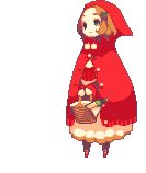
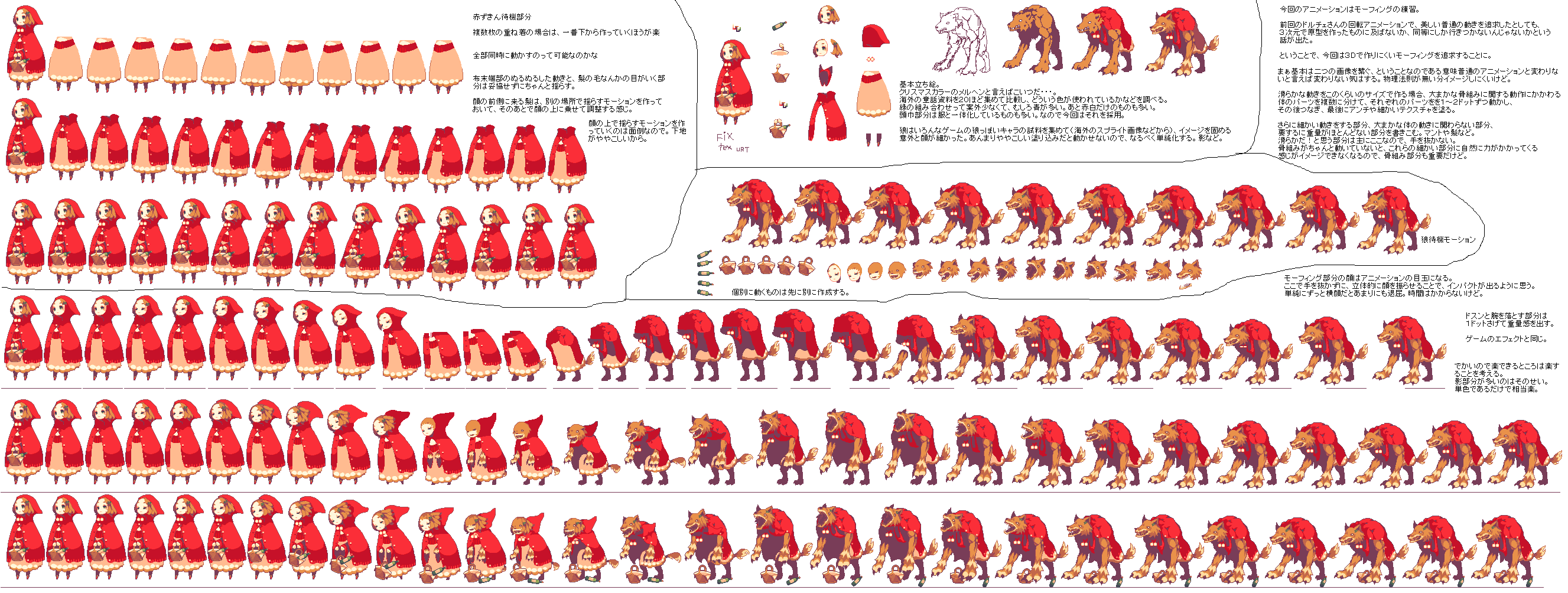
This still keeps the original layout as there's no point to expand the level while testing (the smaller, the faster to test). I also haven't tried some of the sprites, mainly because I've been busy trying to sort out the gameplay itself. Probably in that respect it will be hard to notice the huge amount of improvements compared to the first test.

Click HERE to try the second test version.
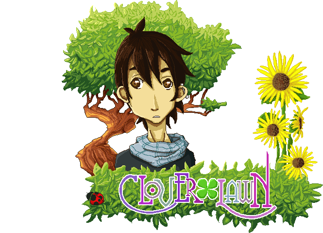
Keyboard Controls :
A - left
D - right
Spacebar- Jump
S- jump down
W - talk/open door/pick up stuff/climb (interact is a better word) 

Things might be confusing at this point still, but the idea is to talk to both of the NPCs to be able to access the room inside the tree. The final text will be slower and the dialogue will give hints to what the player should do.
But leaving the story aside (that will be arranged in time) the mayor advances in this version would be:
- Global constants working along with the phasing of the story.
- Camera movement moves responding to the character's movement (still needs tweaking).
- Zoom in and out depending on players movement.
- Die and re-spam if falling of the 'level'
- Inside tree layout.
- Dialogue appearance.
- Initial Xbox controller compatibility (yes, you can play it with a controller or keyboard) 


There are still far too many problems that need fixing, to list a few:
-Fix camera movement
-Incorporate initial and final cinematic events (need to figure out how to do that :-/ )
-Avoid dialogue boxes to overlap
-Fix characters sprite movement (specially with the xbox controller)
-Set a menu screen
-by miracle... hope to figure out how to control text speed and appearance by pressing keys, instead of having it timed.

There are still loads and loads of things that need fixing, but it's certainly time to speed up with the sprites; any future testing might seem with less improvements as I'll have to balance more between the 'coding' and assets' creation.
Any feedback would be appreciated.


Some pixel art process

In my previous post I mentioned a blog that had a compilation of some 'rules' with regards the creation of pixel art. 
The type of pixel sprites that I'll be doing for the game are relatively big, and the level of detail is high in comparison to initial pixel art where characters could have a 24x24 sprite (like the old megaman games) to a more detailed 150 pixel sprite. 

I've documented the initial part of the process of the creation of the sprites of one of the elements that I like the most: the fountain of the Harpy.
The idea started as a sketch where I added some watercolour, but this was just to give me an idea (and play with watercolours for a bit). I scanned it and modify the background, mainly just to make it easy to work with. 

Then I made it semi transparent and using the pencil tool and preferences that will help me to keep hard edges in case of any movement or modification. I start with a very loose line, mainly just following the contour, as if I was to redo the line work. 


After all that is finished then I can turn off the reference and go into detail to fix the line. The image below is the outcome of a quick line. 


The image below is the how it looks after cleaning up, the idea is to avoid having any overlapping pixels. This will give an effect from further as a clean curvy line. This could be one of the processes that take the longer as is a matter of individually erasing and painting pixels all over the line. At the same time, you need to be zooming in and out to make sure the line is taking the shape desired, as is very easy to get it to look wonky...and in fact sometimes is just hard to correct and can only be corrected once the rest of the solid colour is along. 


This is the difference between the quick first line and the final clean up. This 'rule' wont apply everywhere as the hand that's suppose to be closer I decided to make its line thicker mainly to use a comic like technique of line weight. 


After that I started blocking out colour and shadows, which roughly follows the idea of cellshading with hard edges on the change of each colour/ shadow, this is mainly to give a sharp contrast and help the perception of the shape. In this case the statue is some sort of plaster material with its own shadows, while it will be cover with mould due to the dampness. Eventually I'll add the water falling down. This process is not finished as the shading requires just as much work as the line work. Also the main line will have colour and will nicely blend along with the rest of the colours. This kind of big landmarks on the level need to be very detailed, in comparison to the rest of the props, so I'll keep posting some of the further finished props as I go. 


Pixel art rules - the art of pixel art

Pixel art has always been my adoration; I find it hard to explain, but I think it must be a mix of nostalgia of playing games on Gameboy or Super nintendo and thinking every new game was a master piece. But I also believe that it can be very artistic to manage to represent something correctly having a graphic limitation.
Pixel art certainly had it's beginnings thanks to the limited hardware and display options, the lighter the graphic the easy it is to process in real time. Now a days is hard to see other than portable games or indie developers trying to go down the route of using pixel art as there is practically no need for it. The nintendo 3DS for example, has the capability to render with far better quality than the nintendo 64 could back in its day.
My decision to make my game level 'Sanctuary' using pixel art was merely a personal preference to be able to demonstrate another kind of artwork, get out of my comfort zone and at the same time please my inner child.
Once I got into it, I noticed a massive community online and a huge range of people that focus their work only to pixel art. With this saying, I not only found endless numbers of tutorials, but also a great number of 'rules' that pixel art has; is not as easy as it looks.
Because you have to limit the amount of details (depending on the size of the sprite/character in hand) linework or shading can't just be done with brush strokes, but instead, it has to be carefully placed. It's surprising how easy it is to spot a single pixel out of place, even when is a big pixel art work.
Where a piece of work goes from pixel art to just a low resolution of something bigger, that I don't know, but after my first attempts to make some examples, I think I gained two things: the admirations for everyone who decides to only work on pixel art and the fear that this project might take longer than expected to finish the way I wanted.

Because the rules of pixel art are not 'official', I wont go through them, but I did found this forum, part of the Pixel Joint online community that I found immensely useful, in case anyone wants to give it a go.
There are a lot of examples of games out there that I could mention and elevate to the state of divinity, such as Megaman Zero, Metal Slug, Pokemon, Final Fantasy Tactics Advance, Sword & Sorcery among many many more.
Instead I think I'll mention some artist that I really admire for their unique style and that have been a huge influence while making my own work.

- Syosa:
This artist is like a god to me at the moment. (notice that I'm using some of his work for testing the engine)
Not only his/her pixel art is amazing, but the style and animation is just beautiful and fluid. On his website (only Japanese) he posts and explains a lot of his process which turned out to be really helpful.


His/her work is just adorable and with a very lively animation. Isometric views are his speciality, and love the way he makes little diorama-like images full of detail. 
His work is fast, dynamic and very consistent. He is a very active person in different communities and post work all the time. 


Sanctuary's UI and menus

So all the level planning is pretty much set, all I need to do is start working on the creation of assets to start putting things together. 
Something that I haven't thought much about was the possibility of having a start menu, mainly to give it an introduction and wrap the project up with a more game-like product. At this point all I can think of putting is a 'Press ___ to start' as there wont be any 'New Game' / 'Continue' feature. Because is a self contained level without any current plan of expanding it, there's no point of involving a saving game system nor even putting a pause function as there's no time limitation to complete it. 
I might use that initial screen to add some buttons that can lead to either my website or twitter as a way for people to contact me, also put the logo and my name. Use it as an introduction more than anything. 

Inside the game, I've been missing the idea of implementing any UI (User Interface) as at this point I'm ruling out the idea of having any fighting therefore a health or magic bar is useless. Saying that, I think I want to use the concept of Keara being timid to add a Brave bar which in reality would only measure the progress of the game; this would be reflecting the character getting the courage to scape the level. I think this would help to the understanding of the character and slightly increase the immersiveness. 
Also to add some sort of decoration I've made a 'frame' that goes around the edges of the screen. any bar or dialogue would be embedded around this edges to unify the UI. So far this is only a test. This frame will follow the camera, so it will always maintain the same position. At the moment I'm trying to implement some sort of camera movement that will zoom in and out depending on the character's movement, so hopefully that doesn't get in the way of this UI. 
When I look at some examples of games in respect of their UI, I can see some very simplistic involving some basic information, other (like some RPGs) have a huge range of boxes, icons and menus hanging all around the screen. I suppose my project don't involve much at the moment, and I definitely don't want to add stuff that's not needed, yet I want to emulate the look of a professional game in as many aspects as I can. 


I've found this artist called Sue Hatfield that on her portfolio she has some very nice user interface that include some sort of decoration. I really don't want to make anything too distracting or that takes up too much space on the screen (maybe I'll even reduce the frame I have), but I would like something that adds some decorative value to the screen. 


25.3.14

Would have like...

Using Construct 2 is certainly a very rewarding experience, as I never thought I could pull out a game on my own. I feel like I've already learned a whole different set of skills and experienced loads of different new concepts that I'm sure come along when working on bigger teams and projects. I feel like I can work in a better way to make graphics fit the workflow of coders and at the same time respond to what they can ask me for.
Despite all this I can't help to feel that I would have like to go a bit further; if I was working along with more people, I think I would have liked to get a bit more of a 3D feeling but keeping the same type of graphics.
Games that come to mind straight away that have similar approach to what I originally envisioned are games like Fez or the upcoming Child of light.


Fez (above) has way too much of a pixely look than what I'd like to go for; a very cubic Minecraft-like feel to it, yet I like the textures that are slightly more detail and the happy feeling it has all around. The obvious feature I admire the most is the flat feeling you get until you twist the view around and you realise that the entire environment is in 3D and that all the shadows are there for a reason. 


Other games such as Child of light and Okami (above) are games that are in the mayority made on 3D (including the character) yet they manage with the texture to keep a very flat like environment giving the effect of a painted/drawn look. 


More examples of the work of plane images layered and positioned to give the illusion of depth (which is something that I'll try to achieve) are games like Rayman Legends, Odin's Sphere and Muramasa. All of them , within their unique style, are very beautiful (in my opinion). Despite competing with 'realistic' looking graphics with other games on the same consoles, they manage to stand out, establish their own style and create an incredible level of immersion along with their own story. 
Hopefully I'll manage to portrait something of this magnitude, even if it is just within a small level. 

Dialog construction - script

After I started using Construct 2, I slowly managed to get my head around the type of 'coding' or logic behind it. When I think about it, it's a very logic way to make everything work, and at the same time, there's a lot of room to miss something along the way that won't make things work properly. 
Something that I roughly managed to get working is the dialog, which instead of being scripted so that the player has control of the speed of the text (by pressing 'x or y' button) it will be timed. So when the player enters in contact with the NPC collision and presses a button, the character will stop moving and the timed dialogs will appear as speech bubbles. 
The dialog will be subjected to a global conditional, which I might represent as with a graphic bar as bravery that will be filling up depending on the 'confidence' of the main character Kamea. This will make an emphasis on the insecurities the main character has enhancing the character development. This global conditional will be increasing as she speaks with the right NPCs in the right order, and in the mean time the text will seem varied and less repetitive. 
Another feature will be the idea of Kamea having several thoughts throughout the progress of the game, this again to get the player to understand the character a bit more. 

The dialog creation is something that goes way beyond what I thought I would be doing. Dialog writing surely requires a lot more talent that what I expected. So far I've written most of it, yet I can't help to feel that the dialogs might sound cliché when someone else reads it, not to mention either silly, long or hard to understand. To avoid looking silly in case I make a grammatical mistake, my friend Sarah is willing to help me proof reading it. She has a lot more experience on this as she works as a media consultant and also works on a comic as a personal side project.  
Hopefully I can have the proper text working on the game soon, the only reason why I haven't implemented it is for testing reasons, as I need dialogs to be short and quick so that it doesn't take me long every timeI'm testing any modification I make. 


24.3.14

Updating my work

Because of my personal/legal situation, I've been suffering having some moments of depression, but recently I decided to confront those insecurities and start taking action.
Despite the fact that I already have a job, I'm currently in the situation where I need to find another, and not just any job, but a very good one. Part of my concerns lies in the idea of me not being good enough to go out and knock on big companies' doors. Luckily I came to the conclusion that I have nothing to lose and everything to gain. So I've set some time of work and uni work to update my multiple online profiles, portfolios and website with at least a glimpse of my current and most recent work. 
Going back to using Dreamwaver made me realised how awful it is to leave a software untouched and not practice at all :-/  I'm also thinking on re-doing my website, but that will surely require a lot more time. 
I notice that I haven't even updated not so old projects that I think deserve some attention. 
There are still a few projects that I want to add, but I'm waiting for permission to upload some of the companies work. 
In the mean time I'm updating my Behance, Carbonmade and my own website to be ready to start sending those CVs all over the country. Wish me luck. 


20.3.14

THE ICONOCLASTS


This is one of my main inspirations for creating a 2D game. The Iconoclast is a one-man-team game that's under creation by Joakim 'Konjak' Sandberg and the story spins around Robin, a mechanic in a world where her hobbies are considered illegal. The demos that are available show the very rich environments and the dynamic game play.
The unification on the style is something that I find absolutely captivating; most of the hard edge corners are smooth. There are loads of squared figures on the nature around the levels, like the ground and trees, that gives a unique touch to it.


The bright colours and dynamism is something that is something that I would love to resemble on my game; de amount of details and richness on the environment is something I'll try to work on it to make it to this level.
If you want to have a look at this demo and the rest of the website (there are other games made by him) you should visit his website.


Red goddess by Yanim studio


This is a kickstarter I came across recentrly that caught my attention: Red goddess. 
It's got a pretty neat concept of this girl that can change to other two forms in order to complete her mission. Visit and support the project created by the animation studio Yamin.


When I was trying to think what kind of game style I wanted to do, I was nearly thinking of using simple 3D graphics, and this game certainly got a very nice style that keeps a 2D feel thanks to the textures. 
Also some of the early dynamics look pretty neat, something that I would like to know how to implement on my game. The idea of having different powers but that you have a quick menu to access it appeals, specially when you have a variety of them. 


This is a music video done by Yamin studio. I think the animation is pretty good and the conceptualisation they have as a team is pretty unique in a good way.


19.3.14

Colour test: pallet

 I finally got some time to start working on the colour side of the sprite. The previous post was a test for size and it was mainly an outline and proportions of the final sprite.
I limited myself to a pallet of about 38 colours. I was originally just use no limitation, but then I thought that might be a challenge when it comes to the colouring of each frame of animation. Plus this way it looks a lot cleaner.
On the image below I have the pallet along with the 100% sprite size, a 500% version and a comparison with the concept art. Since the final artwork will look roughly the same size as the 500% one, I'm pretty happy that with the results (got scared when I saw the 100% result).
Next step before polishing the sprite is to test it on the engine. Hopefully I'll start working on other props or NPC's to try them for the next demo.


Tips for anyone that wants to try to do pixel art on photoshop: turn off any anti-alias and change preferences of interpolation (Edit/preferences/general) from bicubic/bilinear to nearest neighbour. This will help to get the pixel finish without photoshop trying to blend colours in between.

18.3.14

Starting to get 'pixely'

Today I decided to start giving it a go to what the in-game sprite artwork is going to look like, before I carry on making complicated NPCs full of detail and colour.
Obviously I wanted to test Keara first as is the main character and she will have pretty much most of the animations.
This is just a quick test of her with a pixel line, although the final sprite will feel less linebase and the pixels more blended. The hight I'm happy with is 167px aprox., mainly because the animation of the hair might vary the over all hight.
Also today I spoke to Ryan and the process of the animation will begin. He will be helping me to get a rough animation mainly for the running/jogging animation. I couldn't resist to make a quick test for the idle, which clearly needs a lot of work, but I think is a progress overall. The main movement will happen on the hair, second by the dress. Luckily the hair won't have as much detail as in the full rendered version, as hair is not one of my strong points to draw. Later on I'll start making some test with the colours applied on pixels.

Meet: Teles

Teles is a rare male siren specimen, despite de believe that they're only females. He comes from a nordic species, and in difference with regular mermaids, he posses two tails (like legs) instead of just one. He's capable to breath under and over water, but he does require constant moist for his skin to survive. His colours resemble a a japanese carp fish with bright oranges and white spots. He's often mistaken by a girl because of his fragile appearance. He was raised in a life of comfort as he was one of the few males born, therefore he was treated like royalty in his tribe.
His attitude can be a bit pedantic and childish at times, yet he tends to manage to see what people are like inside very easily. He's never had the need to do much in life, therefore he doesn't have many abilities that can help him scape. He comes from a very reserved and hostile tribe that are not very open to new ideas and traditions. This is probably his biggest frustration as he's grown with this feeling of restriction , explaining a lot of his grumpy personality. He never learned any self defence as he thought he'd never leave his tribe, so now he's stuck to what others can do for him to scape the conservatory. People in his tribe usually typically uses traditional tridents as a weapon along with their water affinities, yet he finds no desire on picking such a heavy weapon. His arms and vocal cords are sealed with magic by those ornaments, yet they don't posses much power as he's been limited to stay by the fountain.


In respect to his design, I knew from the beginning that I wanted to make him like a little prince. I got mixed feelings with his design, as some people though he was too feminine and slightly repulsive. I wanted to keep the feminine touch and gave a mix sexuality identity (hermaphrodite). Once again with the colours, I wanted to stay away from the norm (green/blue for underwater people) and still keep that colourful aspect of a fish. Also his names comes from latin american roots that mean siren, and decided to give him that name despite it being meant to be for girls. 

17.3.14

Meet: Kamea

Kamea is the protagonist of Sanctuary.   (\k(a)-mea is pronounced ka-MAY-ah). The name has Hawaiian origin which mean 'the one and only'. Just like the name suggests, she's the last one of her kind. The inspiration came from my sister and her obsession liking of unicorns, and it spins around the concept of the story called 'the Last Uniconrn'. In this case the unicorn has a more human like form, but still keeping the horn (obviously). Her tribe used to be a very passive yet powerful one; always in tune with nature and in favour of controlling wind powers.
She's 16 at the time story starts, and not so long ago she found herself running and hiding with a few other remaining members of her clan. The numbers on her clan began to decrease once the value of their horns began to raise on the black market, under the false idea that it granted eternal life.

She's a very kind person, but she's shadowed by a bunch of insecurities and complexes created after years of prosecution and  living in fear. She doubts her abilities and questions every step she takes. Tasks like taking decisions are always a big challenge for her, and she always put others in front of her own needs.

Because she spent her last few years running away, she never completed her training and her skills are far basic, compared to what the capabilities of her tribe can achieve.
Now that she's the only one left alive, she will have to fend for herself and maybe master the techniques on her own.


In respect of her design, I wanted to reflect some of my sister's qualities like the hair, height and skin colour and mix it up with loads of fantasy features. The initial concepts that I made at the beginning where helpful to ask people what their opinion was about the designs and curiously most people ended up liking the ones I based on my sis (4 and 5). Colour wise, I didn't wanted to restrict myself to a simple pallet as I was everything to be full of colour, although in the final pixel art the gradients might be a bit shaper. the golden handcuffs and the collar where placed by the magician to suppress her power, although he ignored to put a constrain in her horn (maybe he didn't see it?). I ended up playing with shadows and transformed them into crazy purple/pink light, just to play around with colours. She's got very small feet and is always walking on her toes; from far away it looks like she's got hooves.

About her personality, I didn't wanted to make her the typical 'I can do it' type of heroine nor the clumsy and funny one. Having my own insecurities, I wanted to explore and create a game that not only spins around the 'goal' of the game itself, but that evolves around a psychologically complex character and how this character would react to all the situations around. On this first level it only involves the main idea of her having to communicate to strangers (which is one of my worst enemies) and finding the courage to embark on a new adventure by getting her and the others our of there. Will she be able to make it?

More characters to come soon... 

Art direction

Following my main inspiration that was seeing the work of Alphonse Mucha live, I opted to follow an art noveau kind of art direction. It won't follow the strict rules of the style, but more like the feeling that his work evokes; a balance between the saturation of detail, beauty in composition and nature. 
Because the first level is based on the greenhouse/conservatory that the main character has to get out of, I want the whole place to be packed with plants, and beautiful iconic places inside the place. I want it to make it feel huge, yet contained. As the place is owned by a rich and powerful wizard, you would expect a touch of eccentricity and aesthetically  rich in every sense. Everything place has to look planned. 
Because of the specimens that he has captives, that in this case will be the main character and the other NPCs, he has created this as a beautiful prison and has position each character in a particular place where he can appreciate their beauty, but keeping a distance while constricting their powers. 


So far I've got set, a fountain, hanging cages, a big tall tree and a special lily cage as some of the iconic landmarks in the level. each one of them will be around one of the NPCs' location therefore the player will have to encounter them all. 


6.3.14

Early complications

So by the time I finished the fist test I was pretty happy with the workflow in Construct 2. Pretty easy to get the basics working, and pretty happy with the way of importing assets and exporting the whole project. 
I've come across where I can't figure out a way to make text to appear and at the same time control the speed of appearance with the keyboard. There are loads of examples in many many games such as Rockman Zero games, but pretty much all the games that involve text based dialog have a similar way to trigger it. 
The basic idea of triggering a dialog event sounds like an easy task to do at first, yet I've noticed that because of my lack of knowledge, I haven't been able to figure it out. I'm pretty sure is doable, just never expected for it to be this difficult. 
I'll probably go directly to ask on the forums and seek for some guidance, but if I can't figure out how to do something this 'simple', I think I'm having low chances of achieving a decent game play for the level.  (rant is over) 


For most cases, when it comes to a dialog event the rest of the game play stops in order to focus on the dialog. I'm referring to the character stoping and not being able to move unless you finish reading/hearing what's to be said. Depending on the complexity of the scene that is, as in some cases the dialog might be part of a dynamic cutscene. Another feature that is pretty common is the ability to press a button and speed up the text to appear, skip lines or even skip entire dialog cutscenes. I've never appreciated this kind of feature, but from now on I will fully respect any game ... with text...any....