While looking for inspiration to do some work I came across this video.
Just thought I'd share it for those in the course who like traditional animation and drawing is part of their daily basis...
Merry Christmas :)
17.12.11
14.12.11
Italian Vernacular Cinema
film is not the art of scholars, but for illiterates
Around 1970´s, working class italian used to go to the cinema every night as part of their daily life. Being transform into a habit, it became more of a social space where the convention of watching a film was different and talking, drinking and smoking during the show was common. It was divided according to classes; Prima and seconda visione was always in mayor cities and the audience selected the film to watch, while the terza visione was more of an industrial and rural area and the audience had limited choices and would watch the same films for a while.

This is the time where auteurs like Federico Fellini started introducing his films full of style and sophistication such as La Dolce Vita (1960) and 8 ½ (1963).
Other auteurs from the time that shared their own points of view about modernity, set pieces and eye line shot where pioneers to the new genre called Giallo, a mystery/horror that had place between 1970 and 1975 with films like The bird with the crystal plumage by Dario Argento (1970), The girl who knew too much by Mario Brava (1963) and Death walks on high heels by Luciano Ercoli (1971).
Speaking of the essence of this films and what the auteurs where trying to express, some of the contemporary films that we can find with similar aspects could be Black Swan (2010), Death Proof (2007), Dressed to kill (1980) and Black Christmas (1974)

8.12.11
CG Reality
Knowing that my interests go more towards cartoonish-animation and videogames, I've always found very impressive the quality achieved in some films that incorporate in a realistic way parts of CG.
On my years doing architecture and trying to achieved a realistic-looking renders was really complicated (specially when you have short deadlines). There are so many aspects that you have to match with reality that you normally dont notice. Lights and shadows reactions are the hardest ones. Textures and camera angles.
The short film underneath are just some shots from Paris, but the impressive work that has been done to make it look like floated is amazing. The water looks really realistic and the reflections on it gives the complete feeling of it. I assume the illumination was made with images from the same place. (Worth watching in HD)
Mimicking fluids, specially water, has always been complicated for me since my computer dyes every time I try.
Also not only in the field of fluid, but the integration animating surroundings to make something surreal yet realistic looking. The adverb below is a good example of it, because of the synchronization with the music and the dance with the animation makes it really good looking.
On my years doing architecture and trying to achieved a realistic-looking renders was really complicated (specially when you have short deadlines). There are so many aspects that you have to match with reality that you normally dont notice. Lights and shadows reactions are the hardest ones. Textures and camera angles.
The short film underneath are just some shots from Paris, but the impressive work that has been done to make it look like floated is amazing. The water looks really realistic and the reflections on it gives the complete feeling of it. I assume the illumination was made with images from the same place. (Worth watching in HD)
5:46 AM // Paris Under Water
Mimicking fluids, specially water, has always been complicated for me since my computer dyes every time I try.
Also not only in the field of fluid, but the integration animating surroundings to make something surreal yet realistic looking. The adverb below is a good example of it, because of the synchronization with the music and the dance with the animation makes it really good looking.
While trying to work in the past with 3D max I remember being a huge fan of Josep Kosinski, because of his architectural background I was years ago, so probably the graphics now are not that impressive, but the point in the composition is there.
Here's the adv called Race from Mezzo. The first one is the complete advert and the second one is the steps for the composition on the visual effects.
It gives you a good idea of how professionals work and the most important steps to considering when making a composition with something that has already been filmed with real actors.
Can't wait to be able to play with light in maya. I always struggled a little bit in 3D max and if it wasnt for render engines like Vray I wouldn't have been able to do anything in decent quality. Hope maya is slightly easier (屮゚Д゚)屮
30.11.11
The 'Auteur'
With an origin in the 1920's, but flourishing 1960 - 65 in where film directors started adding an individual style and taking complete control over all elements of their film production.
Having this creative control added a unique stamp and made this period in time an iconic season for the film industry.
Authors like Hitchcock manage to control the audience emotions (either european and american) by creating a surrealism, suspense and expressionism defined his style and made films like Psyco (1960), Vertigo (1958) and The Lodger (1927).
Now a days I find the director and producer Guillermo del Toro an inspiring and with some similar aspects that make films in which he has been involve iconic to mainstream audience; and also the fact that he's a world wide renowned director that comes from my city (Guadalajara, Mexico) makes it even more appealing to me. He worked on the Hellboy saga, Pan's Labyrinth and the coming The Hobbit, nothing more iconic than that (there is...but can't think of another mexican one)

29.11.11
+ Legacy in the sky +
Having the releases of games as renamed as skyrim or assassin's creed: Revelations makes other games not to look as attractive, specially when they lack of publicity.
I got really excited to get my special edition of The legend of Zelda: Skyward Sword specially for being a big fan of the series.
After playing it for several hours you realised how impressive this game is. Knowing the graphic limitations of the Wii platform, the nintendo crew in charge of the develop clearly aimed to something not too ambitious for the system making a merge graphic style between the cartoonish wind waker and and the obscure twilight princess. The whole game and the cinematics creates a really colourful story telling experience that doesn't even include voice dialogs.
The gameplay is increased thanks to the motion control and now the enemies react to your decisions, making them more complicated and taking it off the just pressing A button battle system.
The maps are constantly challenging being transforming it into a really refresh approach to the series.
Knowing that not only is me (and Sarah) who think is an awesome game, but also it was qualified by IGN as 10/10 Masterpiece makes it even a better game.
Graphics don't make a game, so this is an invitation to all the sceptical to try the game and erase the idea of nintendo being repetitive and childish.
27.11.11
Stop Action
Stop motion is one of the topics that has always been attractive to me, although I've always been really scared to try it because of the amount of dedication it requires to make decent pieces of animation.
Films like Nightmare before Christmas and the Corpse Bride from Tim Burton or Coraline by Henry Selick are some of the proves that animations out of the range of 2D and 3D animation are just as strong and beautiful.

It is a beautiful way to appreciate the traditional art that teams like this ones produce, because it's impressive how they don't seem limited by the lack of infinite canvas and the idea of not being able to correct mistakes as easy as a digital artist can.
I'd like to try this sort of animation one day, but I assume that finding an appropriate team to work with most be the most difficult part since there doesn't seem to be many groups that focus on this way of animation.
Films like Nightmare before Christmas and the Corpse Bride from Tim Burton or Coraline by Henry Selick are some of the proves that animations out of the range of 2D and 3D animation are just as strong and beautiful.
A quick gif showing the process in animating Coraline.
The kind of skills the artist have to have for this animations is what makes it more appealing, since computers is in most cases are only used for editing, but the rest of the works has to be handmade.
The videos below show some adverbs directed by Jamie Caliri and the artist behind it made every single part in paper:
It is a beautiful way to appreciate the traditional art that teams like this ones produce, because it's impressive how they don't seem limited by the lack of infinite canvas and the idea of not being able to correct mistakes as easy as a digital artist can.
I'd like to try this sort of animation one day, but I assume that finding an appropriate team to work with most be the most difficult part since there doesn't seem to be many groups that focus on this way of animation.
22.11.11
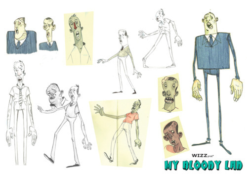
Zombie lad
I found this animation on my Tumblr dashboard and thought I might share it here.
I like the concept and the whole idea seems original.
The expressions of the characters are very well achieved and it reminded me of my old times watching shows like Ren & Stimpy where the characters contained expressions more grotesque and obscure that probably puts the animation/cartoon outside the range of kids allowed programs.
I'd like to have a zombie myself ♥
This is the concept art for the zombie :)
I like the concept and the whole idea seems original.
The expressions of the characters are very well achieved and it reminded me of my old times watching shows like Ren & Stimpy where the characters contained expressions more grotesque and obscure that probably puts the animation/cartoon outside the range of kids allowed programs.
I'd like to have a zombie myself ♥
15.11.11
Street Art ~ Graffiti!
graffiti: : usu. unauthorized writing or drawing on a public surface
That's the definition of the Merriam-Webster dictionary, and several other dictionaries refer to the definition with synonyms of vandalism.
Even though it could be considered to have its origin on cave's walls from the Paleolithic like the oldest one discovered in 1940 at Lascaux in France where there where starches made with animal bones and other natural paints. After that there are some other forms in Ancient Rome (Pompeii) and could be because of that the word itself comes from the word graffiato ("scratched") in italian.Obviously the biggest wave of graffiti expresion started in the 1970's in New York having as a main feature the spay can graffiti that evolved along side the hip hop culture.
It was a way of announcing a presence, either a group or personal, but it was always a way to say 'we will not be ignored'. This was ended up making the language of the streets visible to other social groups.
From what I can relate to graffiti involved into my field, the first thing that comes to my mind is the video game Jet Set Radio for Dream Cast published by Sega, which is a game that describes the basics of life in Tokyo for a "rudie", a term used to refer to young people who roam the streets spraying and skating, as a means of self expression. The game was fantastic, but now that I think back, you where always being chased by a police officer and some other gangs... but the game play and the massive scenarios where fantastic! Also it had a unique artwork and an catchy soundtrack.

Also, there is this film-documentary called 'Exit Through the Gift Shop', filmed by the frenchman Thierry Guetta and featuring artist like Banksy, Shephard Fairey, Invader and many other of the world's most infamous graffiti artists at work. In here you can see the way that many contemporary street artist work, but most important, what they think and the reasons that pushes them to do what they do.
Despite the style and manifestation of graffiti, there are many artist that manage to express the main message through their work, but there's always the counter part of vandalism. It might be worth less making a piece of art while invading some else's property.
There are plenty ways in which now a days graffiti artists manage to express themselves without having to damage or concur to illegal procedures, like one of my favourite artist David Walker, who 'paints' on abandon vans and always creates beautiful pieces like the one underneath:
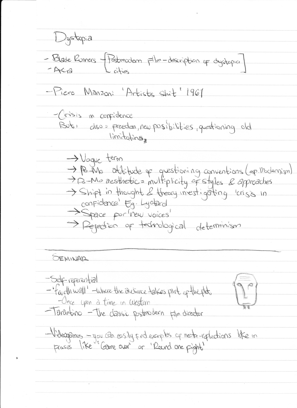
Postmodernism ...
12th Oct 2011

Having its origin in the early 1917 with the german writer Rudolph Pannwitz when he made a reference of the "an-normal, post modern man".

It was a long time ago, but on that lecture/seminar we discussed about Postmodernism.
As a contrast of what modernism represents, the exhaustion, feeling of pluralism, the pessimism in society and the disillusionment with the idea of absolute knowledge were the main subjects in a postmodern mind.

From there, the term of 'postmodern' was used to represent the after modernity, contra modernism, 'late capitalism', artistic and stylistic eclecticism or the 'global village' idea of Globalisation.
After the end of Modernism (15 of July at 3:32pm, to be more precise, when the Demolition of the Pruitt-Igoe project took place - according to Charles Jencks), people started to develop an attitude as a reaction to modernism rules, and basically ended up having the no rules as the only rule (paradoxical...)
At some point it was celebrating what might otherwise be termed as Kitch and it also became against totalising the belief systems (metanarratives) such as religion as people developed a condition of incredulity.
Image of the fifth element showing the 'speed' of society and the unadaptable character to the environment.
As for art, the aesthetics became chaotic, and the complexity increased along with the mixing of materials and styles. Pin-up style and the re-using images as part of a parody became a common way of artistic expression.
This relationship between the city landscape and the artist was reflected in a crisis in confidence but that at the same time started to evoke ideas of freedom, of new possibilities and more important, to question old limitations.

Even though it's is a very vague term, it's clear that it caused a multiplicity of styles and approaches that still have effect in the aesthetics from now a days. Examples of it can be found in some animations like Akira by Katsuhiro Otomo (1988) or the film 'the 5th element' by Luc Besson (1997) where even when they express futuristic ideas, they keep having that idea of a Dystopian society where the image of police states or cities where technology has progressed far more rapidly than humanity's spiritual evolution and the government (or control source) has unlimited power over the citizens.
Notes!:


Notes!:


1.11.11
“Corporate Cannibal" - a frightening pulse
"... I'm a man-eating machine
you won't hear me laughing, as I terminate your day
you can't trace my footsteps, as I walk the other way..."
Those are parts of the lyrics coming out of a stretching, sinister silhouette that kept shifting from on an empty background.
As I was looking at the video from Grace Jones called "Corporate Cannibal" on the first seminar we had of Context of Practice all that came across my mind was "disturbing". That must have been because I had no clue what to expect and didn't had any knowledge of what context or purpose that video was made.
After analysing and watching it several times, it was still a bit disturbing, but paying attention to the lyrics you realize that this music video was not only made with the purpose to promote an artist; but it was a way to express a feeling, of at that time was starting to experience the feeling of globalization. It seems like a simple video at first sight; a white background and a woman being deformed by a computer effect, but once you analyise it, all those aspects seem to go a bit further and things start to make sense.
The woman is a human representation of 'technology' it self. As technology is based on an electric and algorithmic plane, the background takes a place an blank or empty space, yet infinite, where the contrast with the woman being black (and not as in a racial aspect) gives a bigger impact to the image creating a minimalist effect.
" my rules, you fools"
By doing the distortion of her body the whole body and most of the time in a vertical way, it gives an effect of constant movement and instability which is a particular characteristic of electricity; as if she was a modulating signal.
At some point, getting lost in the lyrics, it made you feel like you have no scape to the 'prophecy' she's singing; a no way back no matter what.
The sinister way of singing and the multiple expressions she performs during the video are apparently part of the tendency Grace Jones has; although most of the times she sings in some kind of feminist wave. This time she has mixed an aggressive style of fashion and a genuine concern among many contemporary sociologists and that is the near future effect of globalization in a network society.
This could be a perfect example of how there's no need to represent a song's lyrics in a literal and cinematic way, and instead making it a call for the mass to realize how corporations have no limit in their greediness.
"... I'll consume my consumers, with no sense of humourI'll give you a uniform, chloroformsanatize, homogenize, vaporize...you..."

31.10.11
Reban - Final
I just wanted to show some final images for my character development.
The first one is the final part of the animation. The point where Reban brakes the big stained glass and escapes from the laboratory.
I wanted to give an impression of movement with the crystals in the first plane.
Didn't like the way the broken stained glass looks and also it needs some blood (lol). I wanted to show a different type of crystals in this picture.

This one is just a dynamic pose trying to express more the colour I want for Reban.

This last one, I did it just for pure anger of leaving my USB and not being able to work on the environment's colour, but at the end was the picture that I liked the more. It's a scene of Reban in the test tube, connected to several machines to study him.

30.10.11
Reban - Crystal environment
The final stage for our project was to build an environment for our character.
Since I'm basing all my images on the scene where Reban is escaping from the laboratory where he's been captive all his life, I decided to make work on this one for his environment.
To give an idea of living in a steampunk-like world in the 1800's the laboratory has been adapted in an ex-church with a gothic style. The place is in a cliff just outside the capital city.
Inside the place, the whole attention is in a big test tube where all the scientist test and study Reban's crystals to create a new fuel that will help them win the war.
Even thou I come from an architectural background I never got a chance to make a gothic structure, so I was really eager to work on this, but due to some issues with my computer and time wise I couldn't give the essence of it. Also, mixing this architectural style with steampunk is a meaning of working on details. (hell of a lot of details)
This is a colour sketch I made first to get a general idea:
 At the end I decided to take off the multiple windows in the main tower and leave just the big one in the back (the one that Reban jumps through). The final design of the stain glass was simple and modular, but if I felt that if I went into more details or even a specific picture for a design it could steal a lot of attention.


From here I tried my best to make a perspective, but since it was hard to decide from where to make it and because I love the way 3-point perspectives add a touch of drama, I ended up making a cut to the building so that the inside and the outside could be visible.
It might have ended up looking weird because of the walkway around the test tube, but it was one of the most difficult parts to make.
Also, it is on black and white because my computer was misbehaving and the work I did at school I lost in my USB. (bad excuse, but true :( )

Since I'm basing all my images on the scene where Reban is escaping from the laboratory where he's been captive all his life, I decided to make work on this one for his environment.
To give an idea of living in a steampunk-like world in the 1800's the laboratory has been adapted in an ex-church with a gothic style. The place is in a cliff just outside the capital city.
Inside the place, the whole attention is in a big test tube where all the scientist test and study Reban's crystals to create a new fuel that will help them win the war.
Even thou I come from an architectural background I never got a chance to make a gothic structure, so I was really eager to work on this, but due to some issues with my computer and time wise I couldn't give the essence of it. Also, mixing this architectural style with steampunk is a meaning of working on details. (hell of a lot of details)
This is a colour sketch I made first to get a general idea:


From here I tried my best to make a perspective, but since it was hard to decide from where to make it and because I love the way 3-point perspectives add a touch of drama, I ended up making a cut to the building so that the inside and the outside could be visible.
It might have ended up looking weird because of the walkway around the test tube, but it was one of the most difficult parts to make.
Also, it is on black and white because my computer was misbehaving and the work I did at school I lost in my USB. (bad excuse, but true :( )

I know it still lacks of detail (and colour) but I think I aimed to high at the moment, since it took me more than expected to do this, but I got the idea of having the building covered inside out on pipes comming from everywhere and more steam ducts.
One of my inspirations for that was the bath house from Spirited Away like in the picture below

Also I made the plans and elevations of the lab, trying not to go too technical with it but still showing the more important parts of the buildings and its measures:
First the plan.-


I didn't wanted to put aaaalll the measures to avoid making the image to congested. I used autocad to make them, and photoshop to save them in a web-friendly file so some details got lost in the process.
I hope I was able to transmit the whole concept of this building (otherwise the past four years of my life where a mere waist of time lol).
Once again, I feel really sorry for not being able to bring a colour render of my final product...
One of my inspirations for that was the bath house from Spirited Away like in the picture below
Also I made the plans and elevations of the lab, trying not to go too technical with it but still showing the more important parts of the buildings and its measures:
First the plan.-

The front view.-

A cut viewing from the center of the main room to the main entrance.-

The side.-

And a cut on the side to see the test tube properly.-

I hope I was able to transmit the whole concept of this building (otherwise the past four years of my life where a mere waist of time lol).
Once again, I feel really sorry for not being able to bring a colour render of my final product...
Reban - life in crystals
To be honest, I underestimate this process; I thought it was going to be an easy job and that 2 second animation was nothing.
At first I had an ambitious plan in mind of having Reban standing there and while his crystals and expression changed the view/camera was going to spin around him from the front to the back and at the same time zooming out. When I actually tried to draw that I realize after 3 frames that I had no clue how to make that happen.
So after that, I had in mind to make a scene showing two guards and Reban jumping down in between of them and as he hits the ground he killed both of them. Once again, a scene too complicated for 20 frames.
At the end I decided to plan more properly and be a little bit less ambitious for my first animation, and since I was working on some images related to Reban's scape from the laboratory, I decided to focus most of my illustrations and this animation for this scene, so I came with this storyboard:

Basically he jumps down to a walkway that surrounds the massive tube he was in, then jumps up to the hand rail and finally breaks through the stain glass in front of him.
This is the final result:
At the end it was composed on photoshop at 12 fps, and it didn't came out too bad...
I did wasted loads of time doing details and trying to get the crystals to change shape as well, but since is such a small animation and is in black and white, those kind of details get a little bit lost.
Another big mistake I found much later on is that he's not suppose to have the hoddie at that point of the story, but ...I suppose that's not so important at this point.
Also, I'll try next time to get a reference for movements so that I can manage to capture a more realistic scent of movement.
Anyway, this was my first attempt and as such is got some special value for me ♥
Jerad S. Marantz
Remember the Kraken in the recent film clash of the titans or the amazing creatures of infamous 2? Well if you do, then I assume you understand the high quality of work that the concept artist Jerad S. Marantz does when it comes to creating fantastic creatures.

I came across this artist by accident, and almost refused to take a look at his work since part of the title of that post included the film sucker punch, which I never wanted to see after watching at the trailer.
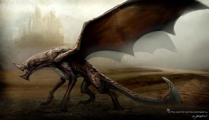
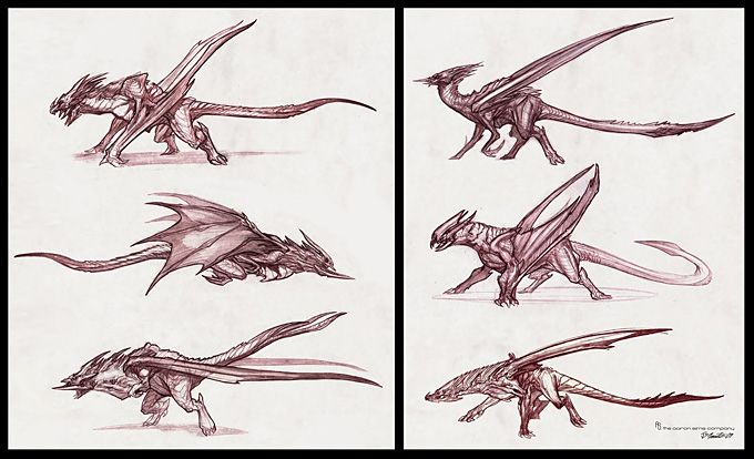
Thankfully I had a look at his work and realise what an amazing artist he is and how many interventions he has done for many projects in the film and game industry as he is the lead designer at the Aaron Sims Company.

Anyway, what calls my attention from his work is the amazing detail in the textures that he puts for most of his monsters. Mixing that with an incredible ability to render and you get real life-like creative monsters and creatures.

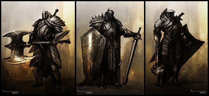
Even though my project with my character Reban (and also Belina) doesn't go that far, I always had the thought of adding this kind of creatures at some point in the story being Belina the one creating this weird creatures. If I ever keep with the story, I hope by that time I have a good technique level to achieve concepts of this quality.
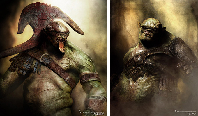
Meanwhile, have a look at his gallery and start stalking /following his blog

I came across this artist by accident, and almost refused to take a look at his work since part of the title of that post included the film sucker punch, which I never wanted to see after watching at the trailer.
Thankfully I had a look at his work and realise what an amazing artist he is and how many interventions he has done for many projects in the film and game industry as he is the lead designer at the Aaron Sims Company.
Anyway, what calls my attention from his work is the amazing detail in the textures that he puts for most of his monsters. Mixing that with an incredible ability to render and you get real life-like creative monsters and creatures.
After watching all his work, I got got really impressed at the ones for Zack's Snyder’s Sucker Punch, so I think I'll give it a chance to the film.

26.10.11
Thought of you
While thinking and doing some storyboards for my flip book animation, I decided to look at some traditional style animations. Most of the works that I found where part of famous animations and really detailed final works.
Then I came across with this impressive artist called Ryan Woodward. Apparently ever since 1995 he's been doing commercial works for Hollywood mainly, but leaving aside of all the works he has done for Warner bros. or Walt Disney Studios, I'd like to focus on one of his most recent works part of the project Conté Animated which involves concepts of exploration of the human body, 2d animation (the illusion of life), contemporary dance and experimental processes for the better understanding of art.
Putting all this forms together to support a central idea of the complexities of intimate relationships.
What I found interesting is that rather than focusing of creating a narrative that communicates a define story, he decided to explore an individual experience unique and personal that goes straight to their own sensibilities.
Just have a look at the video and you'll see what I'm talking about:
Impressive isn't it?
This short was a winner award of merit in Los Angeles Cinema Festival of Hollywood Fall 2010, The Indie Fest award winner, 2D or not 2D animation Festival Golden Pencil winner and many other nominations. No wonder... animation should also be applied to some other forms of art like this one does. Expand horizons.
I know that for my tendency at the moment to do things detailed and my 0 experience on animation, I wont be able to achieve anything close to this, BUT I do intend to work a lot more in a fluid way of work and a to improve my observational skills to a higher level.
Have a look at Ryan's Conté Animated website.
Then I came across with this impressive artist called Ryan Woodward. Apparently ever since 1995 he's been doing commercial works for Hollywood mainly, but leaving aside of all the works he has done for Warner bros. or Walt Disney Studios, I'd like to focus on one of his most recent works part of the project Conté Animated which involves concepts of exploration of the human body, 2d animation (the illusion of life), contemporary dance and experimental processes for the better understanding of art.
Putting all this forms together to support a central idea of the complexities of intimate relationships.
What I found interesting is that rather than focusing of creating a narrative that communicates a define story, he decided to explore an individual experience unique and personal that goes straight to their own sensibilities.
Just have a look at the video and you'll see what I'm talking about:
Thought of You from Ryan J Woodward on Vimeo.
Impressive isn't it?
This short was a winner award of merit in Los Angeles Cinema Festival of Hollywood Fall 2010, The Indie Fest award winner, 2D or not 2D animation Festival Golden Pencil winner and many other nominations. No wonder... animation should also be applied to some other forms of art like this one does. Expand horizons.
I know that for my tendency at the moment to do things detailed and my 0 experience on animation, I wont be able to achieve anything close to this, BUT I do intend to work a lot more in a fluid way of work and a to improve my observational skills to a higher level.
Have a look at Ryan's Conté Animated website.
25.10.11
Reban - Crystal Archetype
REBAN'S ARCHETYPE
While building a character, we need to think about every aspect possible this with the main purpose to understand him/her better and be able to show and develop a more accurate personality.
Reban, being the main character, would fit into the description of Hero due to his unusual circumstances of birth and the series of traumatic events that will lead him into his quest (and not to mention his supernatural ability), but in some way he's also got a similarity to the Child archetype due to his age and the way he reacts thanks to his horrible past. Also he will have to act mature and take responsible decisions after escaping the laboratory.

With the help of a character sheet I manage to get this for Reban:

People have been asking me if he's an elf or an imp, but I never got to think about it in a deep way. My original plan was him to be a human (with deform ears) and the only difference with the society would be his skin colour, but that only because he's in a european-like society where most people have white skin, but this doesn't mean that in that world, in other countries, there isn't any others like him.
As for the design, like I said in the previous post, the crystals change in shape and colour, and later on, he will be able to control them by controlling his emotions.

For the colour scheme I didn't do many variations, since i knew I wanted a good opposite-like look of a classic european person, so the skin had to be tanned, and for contrast I went with blond hair and amber eyes.

While building a character, we need to think about every aspect possible this with the main purpose to understand him/her better and be able to show and develop a more accurate personality.
Reban, being the main character, would fit into the description of Hero due to his unusual circumstances of birth and the series of traumatic events that will lead him into his quest (and not to mention his supernatural ability), but in some way he's also got a similarity to the Child archetype due to his age and the way he reacts thanks to his horrible past. Also he will have to act mature and take responsible decisions after escaping the laboratory.
I wasn't sure which style to go for, but at then I went for the one I feel more comfortable at the moment (just not to make things more complicated...I mean, come on! drawing crystals itself is complicated!). But I'm definitely trying new styles for future projects.
Physical Description:
12 year old // blond-brunette (just the inferior back of his hair) // 151cm height // mid-tanned skin // eyes amber // crystals always popping out his forget, neck and part of his back // crystal colour is normally turquoise but changes with emotions // sharp teeth // basically the only wears a short overall and rarely any tops, due to his constant change of shapes (crystals)
Character Traits:
He doesn't know much about his past...ever since he has memory he’s been changing from hand to hand like an animal. He’s been spending his past few years in containers and only been able to establish contact with a few scientist. Right now, he’s being studied to make use of his crystals as an alternative fuel for new machinery, that is planed to be used in war.
Character Background:
-Family Background: Unknown
Story based on early 1800’s with a steampunk-like environment in which some countries are about to start a war.
-Habits/Vices: Very curious about everything, and even though he’s language skills are not very good, he’s always asking questions.
-Education: None. He learned basic language by scientist and previous owners.
-Personality: Curious and scared of people.
-Likes: Anything new. Food. Natural landscapes
-Dislikes: Needles, medicines and vegetables.
Motivation
-What is his goal?: After he’s realised by the daughter of a scientist he run off with her. His new goal is trying to merge into society, learn about his past and try to find a future.
-His plan to achieve goal: With the help of just a few people he´s trying to escape from being used as a tool for war.

People have been asking me if he's an elf or an imp, but I never got to think about it in a deep way. My original plan was him to be a human (with deform ears) and the only difference with the society would be his skin colour, but that only because he's in a european-like society where most people have white skin, but this doesn't mean that in that world, in other countries, there isn't any others like him.
As for the design, like I said in the previous post, the crystals change in shape and colour, and later on, he will be able to control them by controlling his emotions.

This are some of the crystals' shape according to the last post that I did, just picture the colour on them :)

24.10.11
Lili Ibrahim

This time I'm going to talk about Lili Ibrahim, a Sweden artist based in London who's studying Illustration and animation.
I was just looking at her website and couldn't help to fall in love whit her work. Thinking that she's a student like us and she does that quality of work makes me want to push myself a bit further to improve (probably she's not a student anymore, but still...she's awesome).

Apparently she's got a lot of inspiration from acting, which would explain a lot in how well she represents facial and body expressions.
Just like me, she's aiming to work on the game industry and for that she has done some work in 3D using software like Zbrush, maya and 3D max, but for her illustrations she uses Photoshop CS5 and a Wacom intuos 4.

I strongly recommend to pay a visit to her website, deviant account or tumblr account, and have a look not only to her final illustrations, but also she's got an amazing quality of sketching (which is something I still need to work more on).
She's got a really nice technique on digital painting, in which she changes a lot from the original idea, but I think this gives you a really good opportunity for polish the final product, instead of getting stuck in the original idea, which might not be as good. You can see her process in some tutorial she made for her deviantart profile.
Looks like we've got a big competition or even better a good companion in the concept art industry.

I was just looking at her website and couldn't help to fall in love whit her work. Thinking that she's a student like us and she does that quality of work makes me want to push myself a bit further to improve (probably she's not a student anymore, but still...she's awesome).
Apparently she's got a lot of inspiration from acting, which would explain a lot in how well she represents facial and body expressions.
Just like me, she's aiming to work on the game industry and for that she has done some work in 3D using software like Zbrush, maya and 3D max, but for her illustrations she uses Photoshop CS5 and a Wacom intuos 4.
I strongly recommend to pay a visit to her website, deviant account or tumblr account, and have a look not only to her final illustrations, but also she's got an amazing quality of sketching (which is something I still need to work more on).
She's got a really nice technique on digital painting, in which she changes a lot from the original idea, but I think this gives you a really good opportunity for polish the final product, instead of getting stuck in the original idea, which might not be as good. You can see her process in some tutorial she made for her deviantart profile.
Looks like we've got a big competition or even better a good companion in the concept art industry.
22.10.11
Jace Wallace


Proportions and shading for skin is one of his strong aspects that I admire, but also the composition and originality in most of his works is impressive itself.


Something that I notice while looking at his blog is that he refers at his works as "sketches" or "doodles", even though for me they are really professional looking... I suppose that's call talent.
For my character, Reban, I'm not even trying to change my style, since 1) I don't have enough time to do everything again and 2) it would look awkward to have to different styles in the same project, so I'll stick with it for now, but I'm definitely going to try to be more quick with my sketches from now on... at the moment I need to improve my quantity of ideas, and then the quality.


by the way...this is his website
Subscribe to:
Posts (Atom)