28.2.12

Book cover

Once again, non relevant to anything, but it's part of my practice so I'll just post it. 
As some people know I've done a book cover in the past and the same writer asked me to do another one for his newest project. Awesome! 
So the most important thing I get from this is practice and stuff for my portfolio (also my name is in the book which makes me feel happy).
Anyhow this is the final outcome of the picture:
(apologies for the massive watermark, but it will get published, so I don't wanna get into trouble)


Right! now time to focus on the essay ... fun! 

27.2.12

Quetzalcoatl

Right so after a massive mental/art block, I manage to settle down my ideas into something more concrete.
Since it's 2012 and the mayans say that we're all going to die, why not basing my game scenario on it! (oh yea...also cus I'm mexican...arriba! )
So from all the legends I know from ancient Hispanic cultures Quetzalcoatl is my favourite one and it's also because a serpent with feathers is cool.
I've been looking at the patterns and details from several ruins and I'll try to reflect some of the aspects from this amazing culture.
Here are the mood boards with pictures that inspired me:


Any how, I'm not going to make a historical recreation, instead I'll adapt some of this concepts to a fairytale-like environment. It's a really huge concept and there are loads of details and ideas I would have to work on, I just hope it's not too ambitious.

26.2.12

Xilia World

Tales of Xilia for PS3 is a game about to come out in Japan from Namco studio.
I've been crossing fingers for it to someday come out in Europe, but meanwhile I've been following some updates and trailers.

Asides of me being a stupid fan of the series, This time is the environment that caught my attention since I liked the feeling they put to the scenarios below.
The concept of the harmony between water, trees and a city landscape is really attracting. Also the play with light and dark in this case seems to be a concept that needs to be carefully played, but the dark silhouettes that you get give you an amazing feeling of magic and mystery.  


25.2.12

Less is more

While thinking of ideas for the scenario many ideas pop in my head, yet none of them are concrete or maybe it's just me that can define what concept I want to go for. Some of them are way too ambitious, or at least for this since the focusing point is quality over quantity , yet some other go to an easier target which I have tried before in the past.
As most of the times I like to try something new, get myself out of my comfort zone and challenge myself with something near the edge of idiotic, and this project won't be the exception.

I've been looking at all kind of inspiration over this past weekend, some of which I plan to post later, but none of them have gave me that flash of inspiration that I'm looking for. Most of he times I tent to over thing my ideas, multiple times causing a frustrating outcome of my work and covering part of my possible potential for some pieces of work.
I started realising that whenever I force myself to come up with an idea I end up blocking myself of the basic aspects and over saturating with unnecessary details.

Thankfully I happen to finally get to see the film 'In time', which was recommended by one of my classmates during a PPP presentation. I started thinking of the core idea for the film and not taking in count the multiple flaws of the film, the plot itself is absolutely fantastic.
Recurring to simple and essential ideas that we usually don't consider due to its own common nature can sometimes bring up some of the best and well established ideas; in the film's case, time.

If something my years on architecture thought me is that most of the times "less is more" and I'm intending to apply this to my concept.

22.2.12

Yi Lee


Yi Lee is a Corean artist who I've been following for years now. His most recent works are more towards characters' concepts, which I find really helpful as reference and inspiration for my own creation. 
The reason why I find his work amazing is not only the style (a characteristic semi-anime one) but the colours and brush textures. The contrast he creates with some key colours using them as light and soft tones for shadows are some points I find attracting, even more than the concept and composition itself. 
Make sure to visit his website (and translate it to make your way around it):


21.2.12

Yo unity!

Unity Web Player | tutorial_web
_______________________________________ Unity Web Player | boxes_web
Unity Web Player | boxes_web

9.2.12

Little & Large


Finally!
This is the final piece of my first 3D animation:  "Little & Large"
I'm really glad that I manage to get it done on time, since I had some technical issues on the way.
Loads of room for improvement, but I'm really happy with the outcome considering the amount of time I had to make it and the little knowledge I have of the software.
Also, I'm really thankful that my friend Adam Fergler, once again, accepted to work with me and made and awesome melody for it.

I'd love to have some feedback about it!!!   ... if I manage to get a better computer soon, I might come back to it and fix some of the little details that keep annoying me every time I see it.

oh! and just for the record...it is inspired on my actual working space (I just couldn't get to get aaaall the details)


E.T.A.

This is nice short animation called "E.T.A." made by Junkworks.
It has a really simple plot, but it is driven in a way that makes it outstanding in some way. No surprise it won the   Best animation award Break Point 2008 in Germany and the Best New talent award on the Aarhus Filmfestival 2008 in Denmark.
This shows you the power of only one Director (Henrik Bjerregaard), two modellers and animators (Soren Andersen and Michael la-Cour) and one music composer and editor (Rasmus Kudahl).
Space topics are definitely not part of my main interest, but when something is well done as this, I not only appreciate it, but I also enjoy it.


Tahyon - 3D fractal

One of the artists that I recently started following is Joldos Dan Emanuel, a CG artist (and furniture Designer), who has an amazing collection of works, most of which are representations of 3D-like fractals. When I first saw his pictures I thought they where produce on a fractal software (I've try some before) but I haven't seen any that produces ones of such a good quality.
Then, while looking at his website I saw a video and it was just surreal. It is a nice composition of constant flow and morphing shapes that hypnotise you. The concept of space and physics as know completely disappear and the boundaries of creation seem endless. 


I really wish to have to make a concept like this, probably adding a narrative, but the idea of breaking those boundaries is something that excites me and will definitely will look in the future for ideas like this one. 

Growing up


One of the things I like to look at is rather than following only mainstream work is following track of some other students from different universities around the world.
This time it was Lucas Ridley who caught my attention with his impressive animations that he made while  being in his student years at Vancouver Film School under the program of 3D animation and visual effects.

The one above, 'Growing up', seems to have a similar topic as ours for this project (Little and Large) which made it even better.
The animation it self, regardless of the amazing illumination and well done textures, is really fluent and vivid. There might be some tiny little mistakes on some parts, but being a student and achieving this quality is something really impressive.

Taking from this not only to put effort on my future animations it also encourages me to do more work with the post production of my projects.


4.2.12

Matryoshka light

I just added some lights to the scene (quite quickly since it's quite late and I'm working tomorrow morning) and started testing some renders. 
This is a quick one with the Maya software. Cant see much but I wanted to see how the books texture look since I changed them a little bit. 


And at the end I just wanted to see how it looked with Mental Ray and it does make a difference. The only down side is that this one below took 1 min 22 seconds and multiplying that by the 1200 frames that I have it's going to take a while (although that was on my computer, it might be faster on the uni ones).
Still got to work a lot with these lights and their shadows; modify some textures and test the look of some shadows in some of the scenes, specially with the fighting ones. 


Any ideas or suggestions?  ... 


Matryoshka texture

After finishing the main parts of the scene for the animation I wanted to start getting some textures just to start testing the looks of it. 
This is just a scene of the scene before importing the dolls into it, but after a bit I added more stuff and change the whole arrangement of it:

I know the scene is simple, specially because my original plan was to recreate my own desk, but then doing too many details might cause the scene to be too distracting of the actual subject and also really time consuming (which is something we all lack ). This picture below is more or less the final arrangement of the scene. Even scanned the posters and post-its from my walls. 

This picture below is trying some other textures, like some for the dolls that are done and also trying the bump on the book and desk. I hope that putting a scan of an actual manga I have in my room doesn't get me into trouble lol.  

Even now I'm struggling with defining the style for my animation. I think is one of my biggest mistakes from the begging because I didn't established a style to follow and now I hope it doesn't turn out too mixed since some of the textures are too cartoonish and the rest aiming more to realistic. 
I'll try my best to blend this with the illumination. 
What do you think so far? any suggestions? 

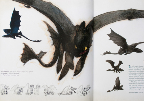
How to of how to train your dragon

How to train your dragon of Dream Works has recently entered my list of favourite animated films and recently I found in youtube this video that shows the behind the scenes:


Being in the process of animating my russian dolls made me think again of the amount of steps and hard work that need to be put on an animation, specially if it's one that's going to appear on the cinema.
Team work is what I got more from this video. It is obvious that doing everything on your own makes things easy since you have control of every aspect, but the level of skills is different for every process and that can affect the ending product of your final piece.
On studios such as DreamWorks it must be really important to get a really good team, experts on their own fields, but more important, a team that's on tune with what the project is all about. Style, graphics, movement, sound; everything has to be completely synchronised and that is something that I admire from studios like this one.


Mastering UVs!

At the beginning I thought that my scene and the whole animation was going to be really simple because middling the Russian dolls wasn't much of a hassle. My initial idea was to animate their faces to enhance the expression of the movements and give them a nice personality but in order to do that I needed a proper UV mapping for the models. Now I've done UV mapping before (on 3d Max) but never came across with something as problematic as this.
It might be my lack of experience with this software or that I just cant retain any information but it took me three sessions to finally get the hang of it (that plus my file getting damage and causing me to do all over again).


Because of their round parts at the top both the inside and the outside, it require to cut the edges on the UV editor, then cut the edges on the back spine of the main model just to manage to properly unfold the figure into something that I could easily work on photoshop and after effects to get image sequence for the faces.
After finishing this I completely feel like the master of UVs... I just hope that I don't screw up with animating them since they all have different emotions during the whole animation.

I really hope the rest of the process works with easement since I'm tuning out of time for the final critic.

2.2.12

Alma


This is a beautiful animation called Alma, directed by Pixar's animator Rodrigo Blaas.
Having people from pixar working on it can probably give you an idea of the quality this piece of work has. The thing that caught my attention from it is not only the amazing graphics, but the way they adapted this well know style into a more spooky narrative. Something always bothered me is when my parents used to tell me that cartoons are only for kids, when there's actually a big potential to make other type of plots without having to necessarily rely on dark and realistic CG.
PlotThe film has no spoken dialogue, just lighthearted music playing throughout the background.
A young girl is walking down a snow-covered street of a small French town. She stumbles across a wall with names written in chalk on it. She adds her name, Alma, to the wall.
Opposite the wall is what appears to be a closed toy shop. The doll in the window looks like Alma, and she is fascinated by it. She looks away briefly, and when she looks back the doll has moved from the window to a table in the center of the shop. She finds the door is locked, and angrily leaves, but hears the door open as she walks away. She excitedly walks in and the door closes slightly; there is no one else in the store.
Alma stumbles upon a small boy doll riding a tricycle which has fallen over. She pick it up and places it on the floor upright, and it heads towards the door, but the door closes on its own. While the little boy continues to slam against the door, Alma sees that the doll has somehow moved up to the shelves. She climbs up the shelf and reaches for the doll's face. In an instant the doll's eyes move, and a quick flash of images, and suddenly the lens is through the glass eyes of a doll, sitting on a shelf in the shop. As the camera pans away, we see that Alma has become the doll and is looking around the store like all the other dolls, trapped and unable to move.
As the camera pans out, another doll appears in the window suggesting the appearance of the next victim.


1.2.12

Isolation - Final animation

Finally and after a long day of editing, we manage to put it all together.
I'm pretty proud of what we manage to achieve in such a short time, so here it is:


At the end we found some little details that probably we'll end up fixing just for the sake of finishing the project properly, but for now this is our final version.
Also, last minute, but me and Ryan decided to submit it for the British Student Film Festival since the dead line was on the same day we completed the video we had to run and send it. Hopefully it gets on time.


So, what do you think?

Isolation III

This is the animatic with the music composed by Adam Fergler.
It's not the final version at this point but I'm pretty happy of how well it goes and how much it pushed up the whole feeling of the animation.

Almost forgot...Inspiration!

One thing I forgot to post about is the inspiration that I had for my instructional video.
Having to make it really quickly I didn't have much time to do a deep research, but luckily youtube is full of this kind of video references, and one of the funniest persons I've found online is Charlie Mcdonnell, because aside of his natural charisma (damn you Charlie) and a good sense of humor, he has loads of experience on making home-made videos.
Even though they might be about random subjects, his skills on editing and way he plans and composes most of his scenes is what has been pushing up his videos' quality.


Now, even better than just having to look and american doing he's videos, is nice to know that we have a talented and funny person in our course that has good skills in making personal videos.
Sadly for me, I'm not made to be on the screen and even less, to talk in front of a camera, but that only gives me more time to focus on other aspects of my potential future films.

Instructional Video

The first part of the module for Digital Film Production we had the assignment of making an instructional video that lasted about 1 min and could be about ANYTHING. While working in a Mexican restaurant for over a year in the UK I've seen so many atrocities on the way people eat mexican street food, so I decided to make a video of it.
The planing was easy: ask my friends from home to describe me their process of eating a taco.
I got load of great ideas, some of them might sound funny or even silly, but I've done them all in more than one occation. 
I always knew mexican food was unique, but never thought that even the way of eating had it's own tradition. 
For the storyboard part I thought I was doing well by showing the gesture that I wanted and having a balance in the sequences between the speaker and the food shots.
This is what I came out with:

While filming I realised many MANY things that I didn't took in consideration:
- timings for each shot and the speed on the speech
- lighting (started filming when the sun was going down, so some shots are brighter than the others)
- scenario (I knew I could use the restaurant but didn't really thought of where exactly)
- audio (it was hard to capture the voice due to loads of noise in the kitchen)
In general, I honestly think I underestimate the planning process behind any project. Lesson learned!
Thankfully, my friend was really kind to help me out and he helped a lot with his patience.
This is the final output of the video:


At the end, my boss absolutely loved it and decided to put it on the restaurant's website (lol) so it will be publicly shown soon at www.pinchepinche.com

DYE Fantasy

While most of the animations these days are focused on an underage audience (except some parts of japanese animation) I like to see that there are some people out there interested on bringing it to a more mature audience. The animation itself it's gorgeous and despite the mild gore it can content, I think the value of the idea, the colours and the very well textured composition makes this animation worth watching.

Just mind the blood...


DYE "Fantasy" Official Video by JEREMIE PERIN Tigersushi and Excuse My French are pleased to present the new video for DyE's new single, Fantasy.
 Directed by animation wunderkind Jérémie Périn, the video tells the story of a group of highschool kids ready for teenage mischief. They break into the local swimming pool intending a session of innocent nightswimming, in an awkward climate of romance and apprehension. What happens next is for you to discover here.
Directed by Jérémie Périn Written by Laurent Sarfati & Jérémie Périn Artistic Direction by Mikael Robert Produced by Excuse My French / PH & Tigersushi Executive Producer : Constance Guillou Production Coordinator : Perrine Schwartz Commissioner : Jill Caytan