In the case of Sanctuary I tried to embraced the art nouveau/ Victorian style as much as possible, by keeping detail and lively colours. Of course this theme is subjective and didn't stick to the rules of any style, but that's mainly to give it a twist of my own creation.
For the logo at fist I wanted to make something quite stylish, and went all the way with the idea that I liked the most:

I knew it was saturated, but I think I thought about it far too much to the little flaw on it's creation: it's unreadable!
People who looked at it just couldn't work it out at first, so what's the point of a logo if it's not easy to recognise. At this point I decided to stop working on it and get rid of it.
In the mean time I also created little logos for the characters, maybe a bit unnecessary, but I could't help myself.
I wanted to use iconic imagery from what the mythical creatures behind their creation represent. Kamea has a Unicorn, Edric a medieval dragon. I used a lion for Azmer as Wemics are not common part of mythology. For Teles I didn't wanted to use a mermaid as it would drive people to think he was a girl, instead I used a jewel in the shape of a water drop, to represent a bit of the royalty in his family line. Alba and Kera where the difficult ones; nymphs don't have a representation other than nature so my first thought was flowers, then I thought about the sun and the moon, but I decided to put them as birds, mainly because I didn't wanted to give away the idea of the source of their powers straight away.
I didn't really spent much time on these, so I know they could have done with a lot more work, but it was just to have them printed with their names on.
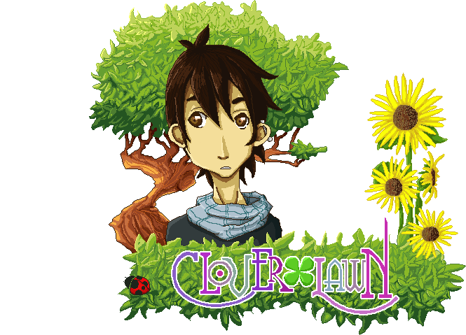
After a bit I came back to remake the logo into one of the ideas I had from the beginning. It's more simple and it doesn't have any fancy shapes. Because it was just the word, I wanted to work more on it than just keep it in simple colours. At the end I tried to make it look like a fairy tale book cover by simulating gold and leather in the background. Not sure if I did it right, but at some point before adding more details I thought about it having to be in pixel art as well, therefore I stop to avoid making my life more difficult.
No comments:
Post a Comment